

POP!
Identity and Branding Unit at University of Portsmouth (2019/20)
BRIEF:
Three students and I had to brand ourselves as a collective and showcase our own work in a way that fit our own brand identity. Together, we had to create a digital presentation to showcase the brand we came up with, and our work within that presentation. We decided on a theme of pop culture, as we each had seperate sections we were interested in. Fashion was my section, and POP! was the result of this collaboration.
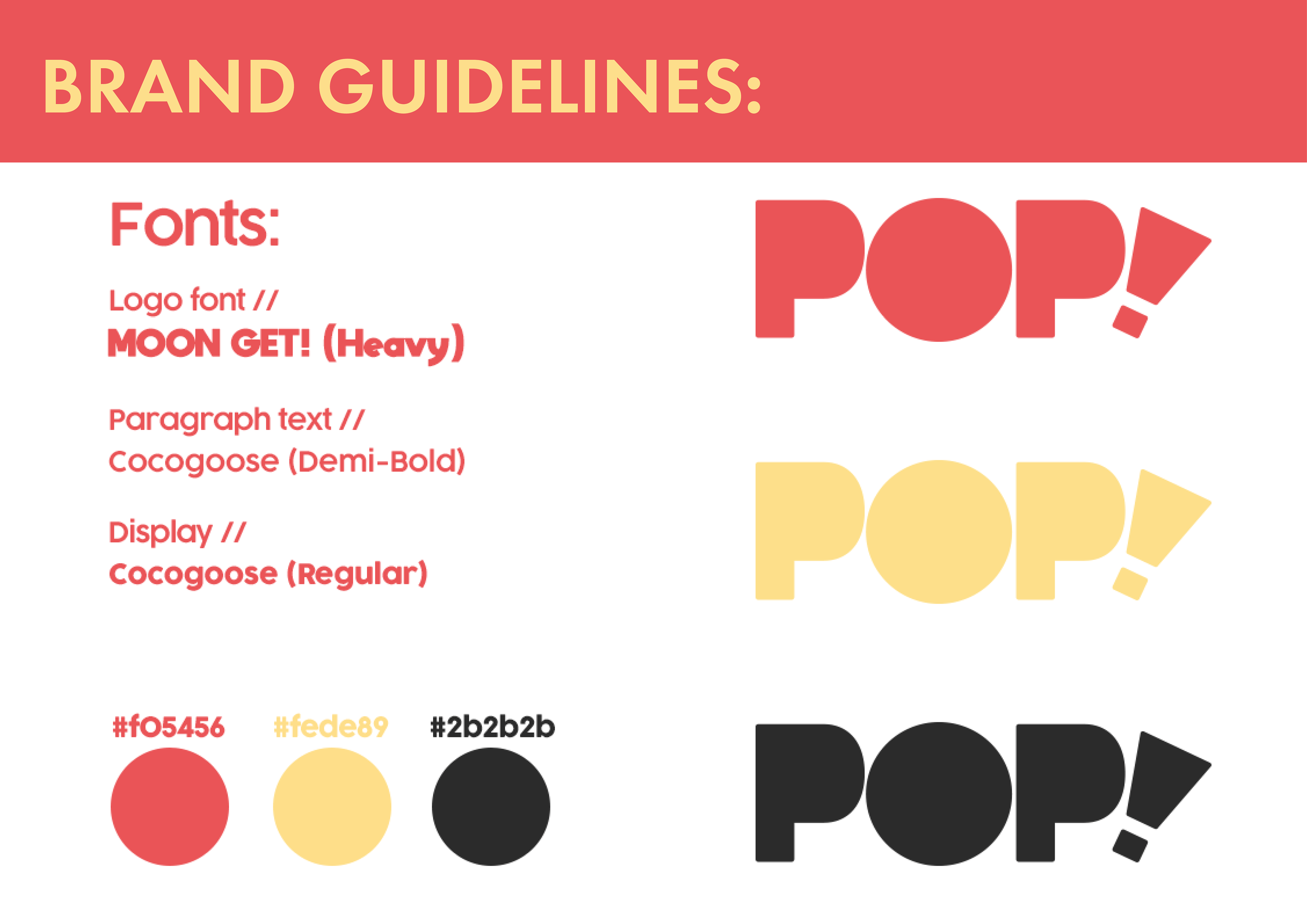
BRAND GUIDELINES:
For POP!, we wanted to communicate ourselves as professional, fun and creative designers. We based our name and brand on the fact we wanted to communicate these aspects, and that we all enjoyed different aspects of pop culture, hence the name POP!. We went for a muted colour palette of red and yellow, as we agreed that these colours represented our creativity and pop culture theme well. The fonts we chose also reflected our identities as designers, and we wanted to come across as friendly so used a simple curved font. We wanted our logo to be simple, but stand out. We utilised large, curved letterforms which fit our brand aesthetic to achieve this.
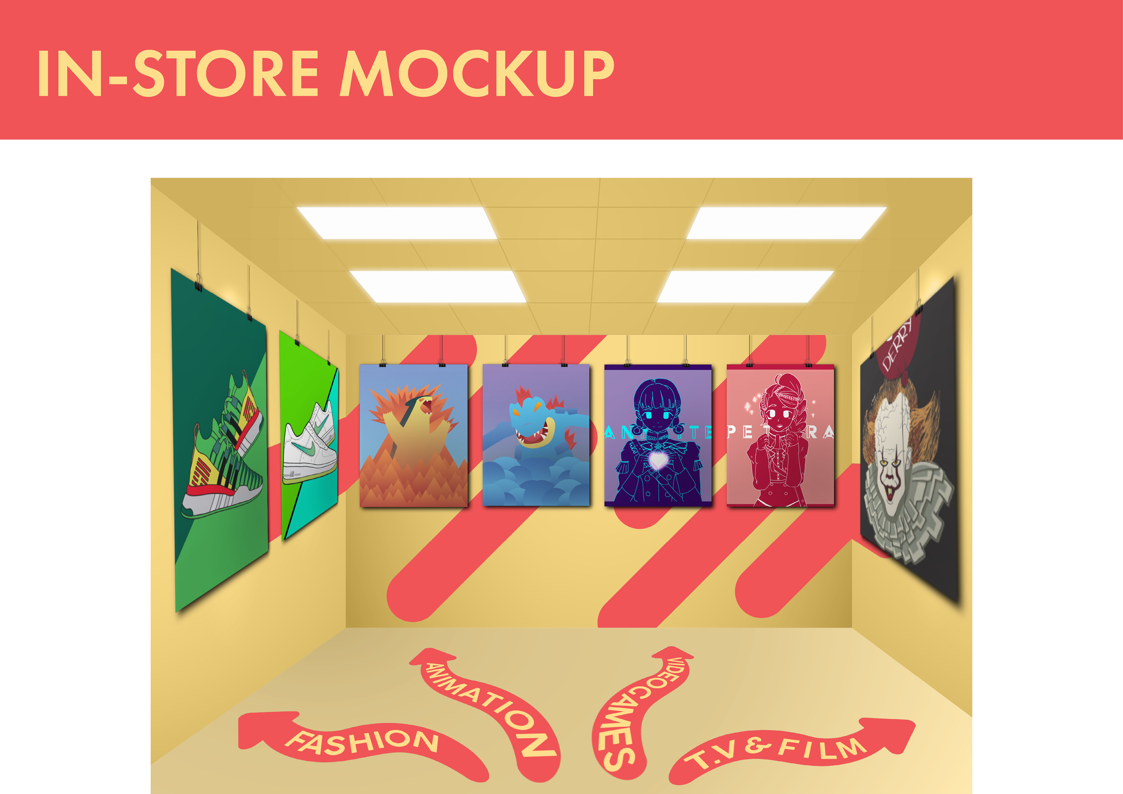
IN-STORE MOCKUP:
We wanted to show how we could apply our brand inside of a store, and how our work would be presented within it. We wanted to apply our dynamic design style to the store, so I mocked the large design elements on the walls for the store. Along with this we added a way-finding system within the store to direct visitors to the respective sections of our brand.

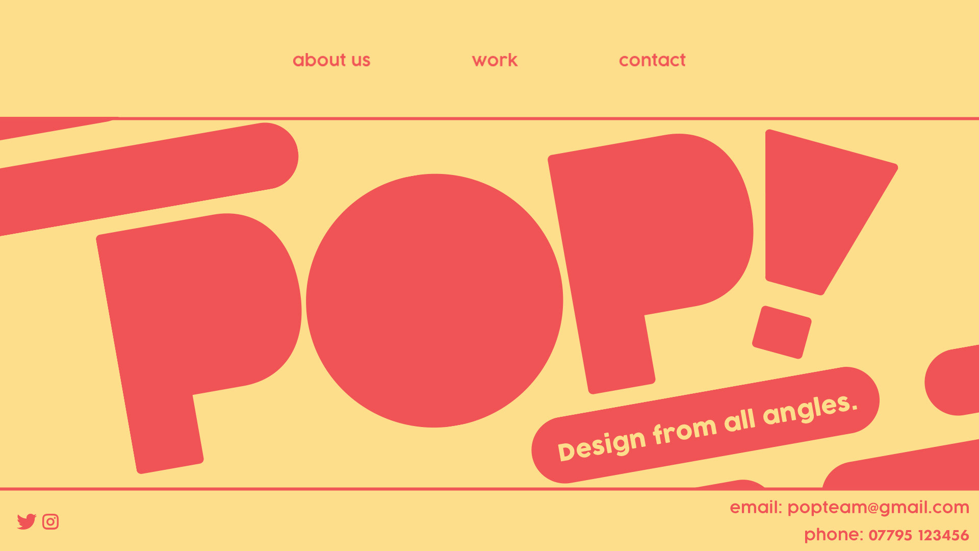
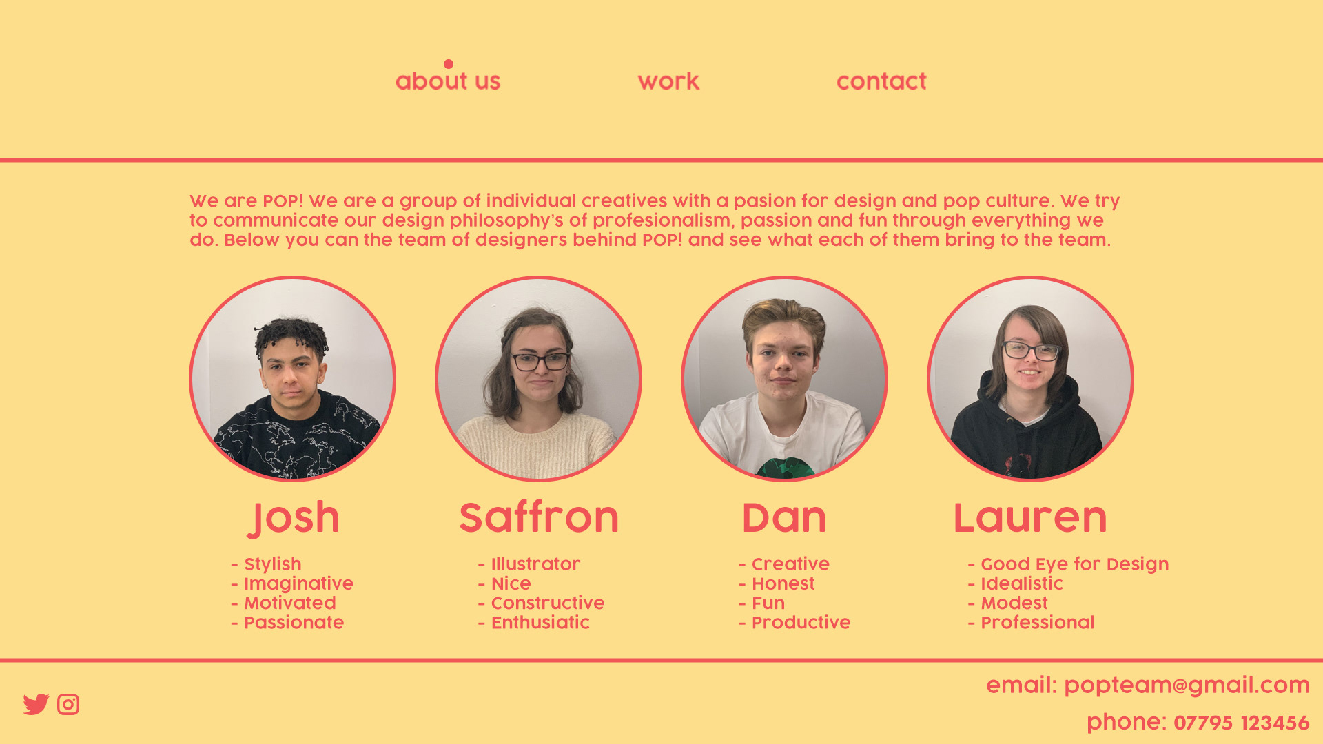
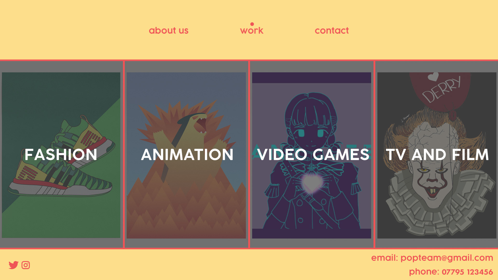
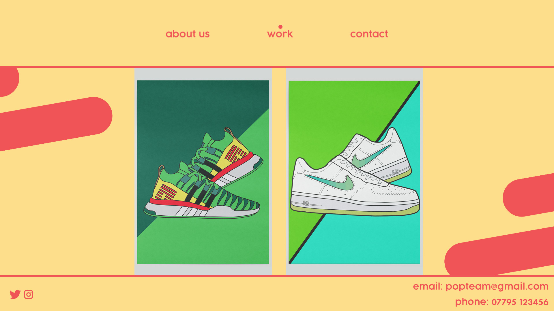
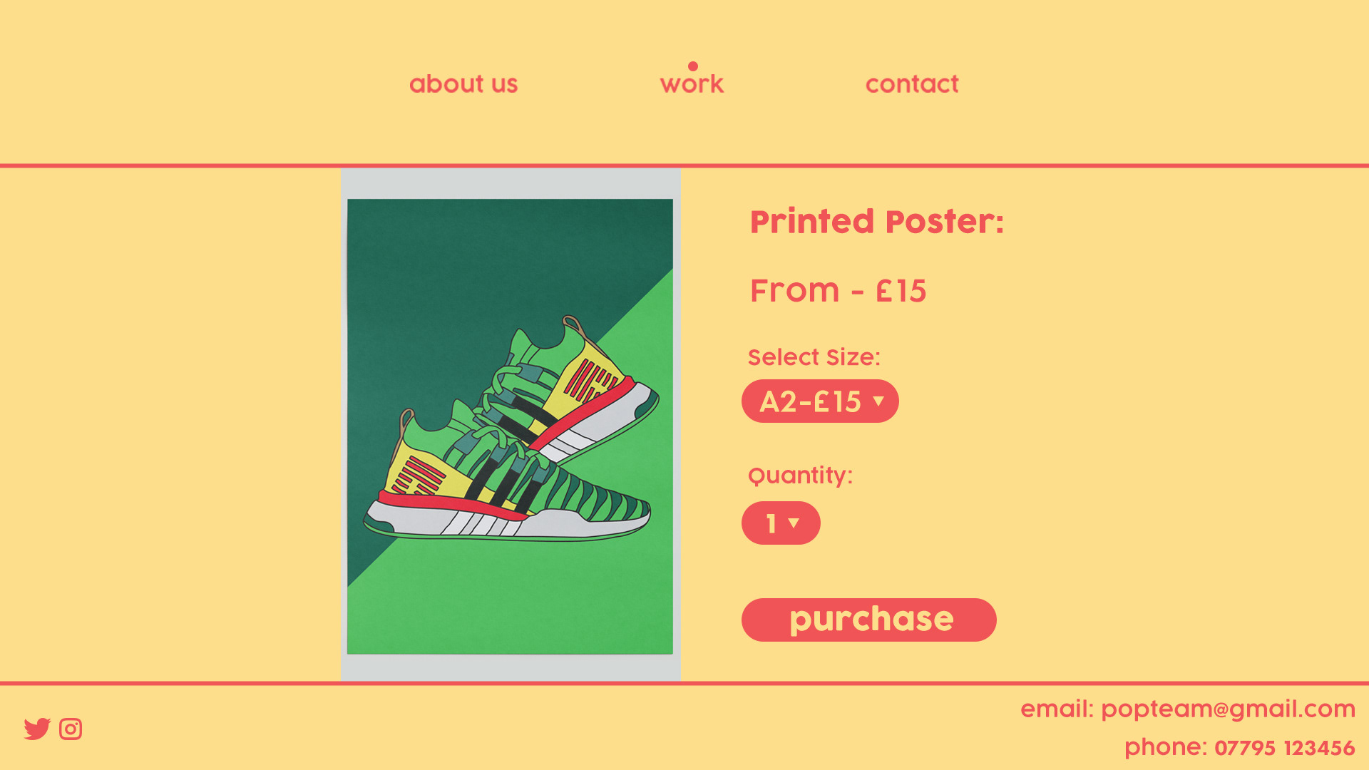
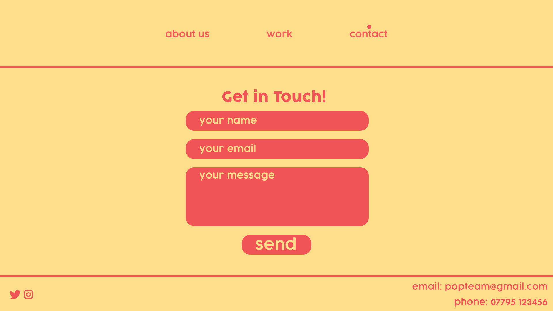
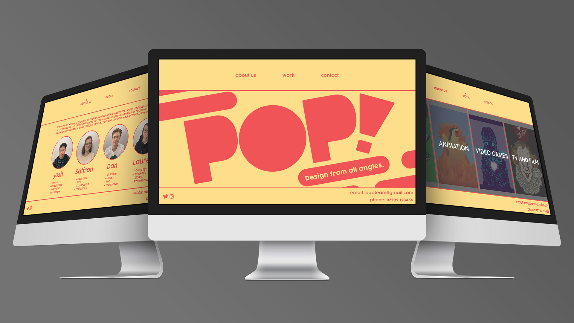
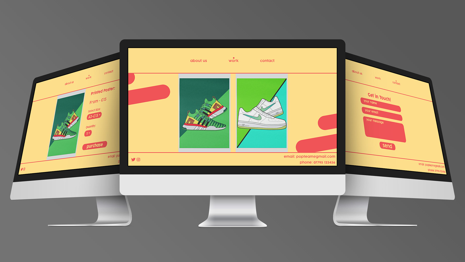
WEBSITE:
I designed the website for our brand POP!. For our website, we wanted it to be dynamic yet simple, and we needed it to follow our brand guidelines in order to make sure our brand was consistent. Within the website, we wanted visitors to be able to find out about us a collective, and as individual designers so I added the "about us" page. To keep with the friendly aesthetic of POP! we used lowercase type throughout the website. We wanted our website to showcase our work and have the option for people to purchase the pieces, as this project was about us showcasing our work as a brand. I also mocked up the websites to show what they would look like if the website was made.


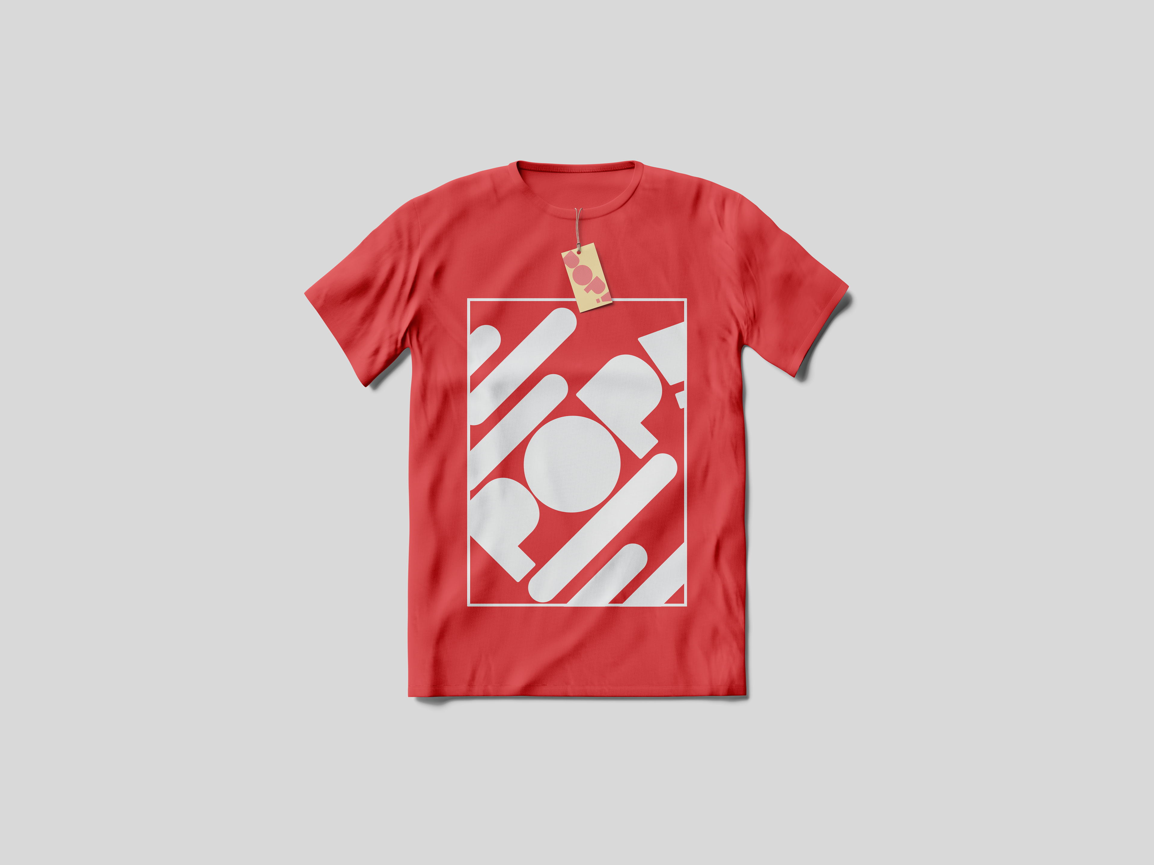
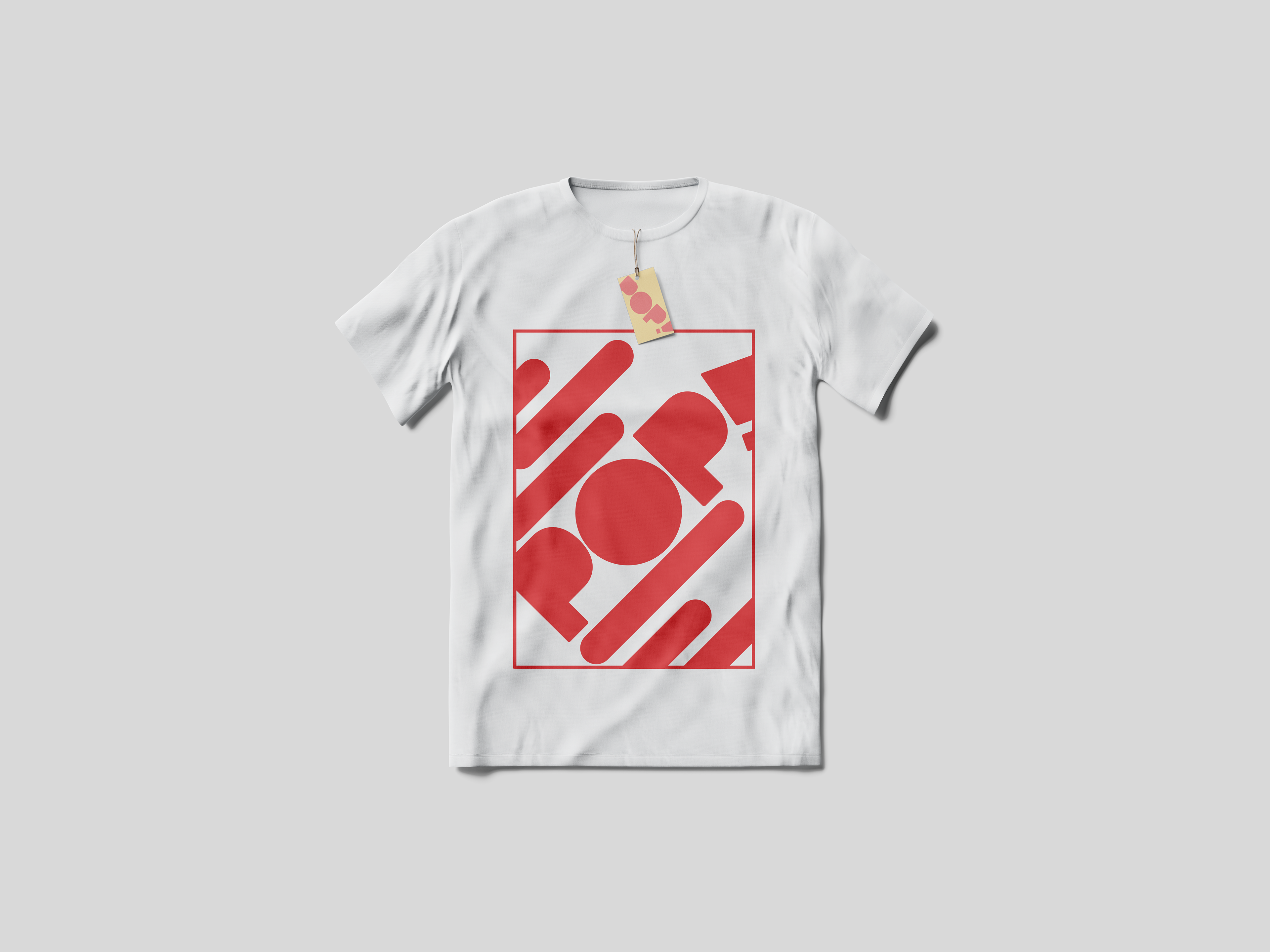
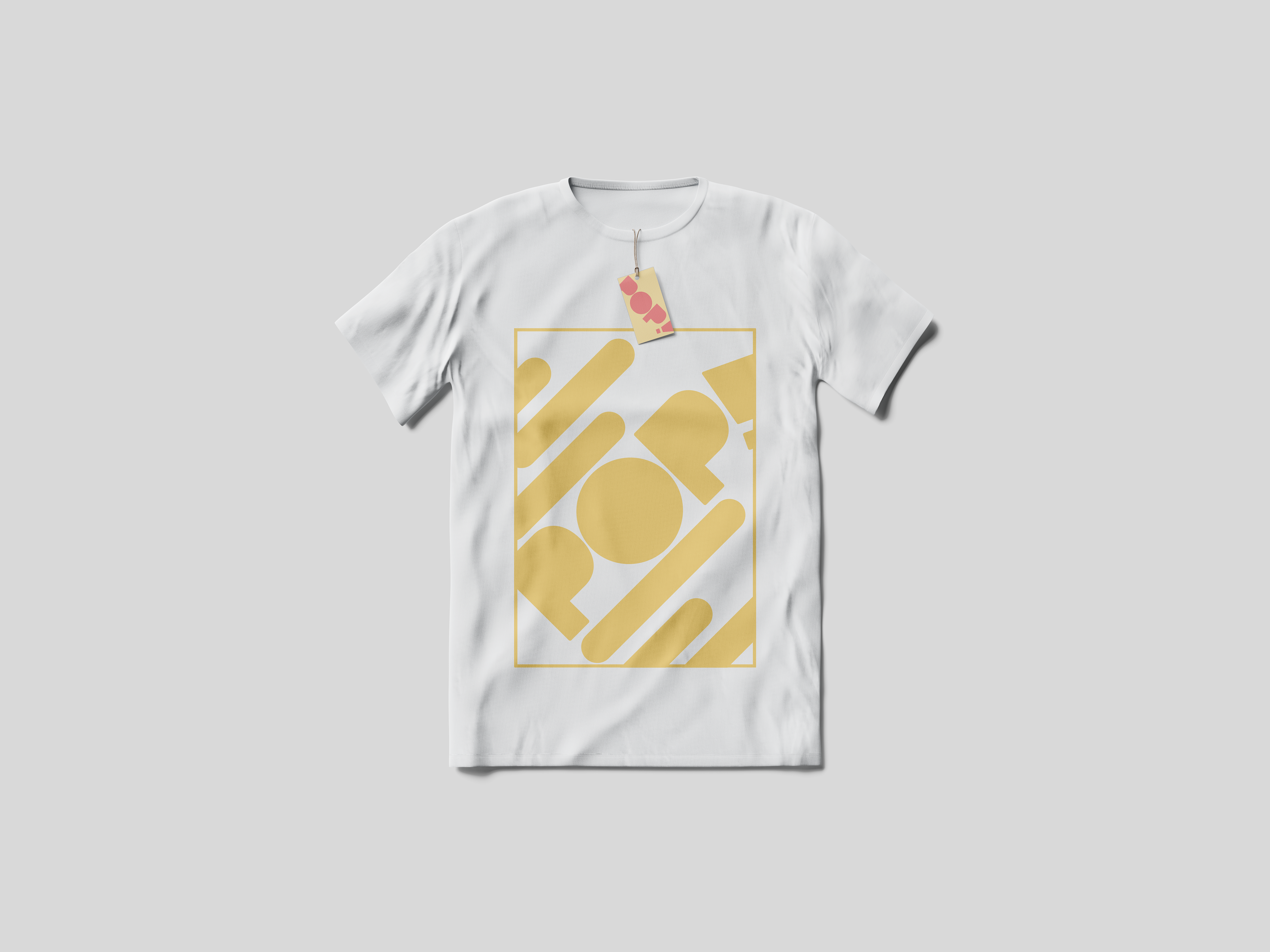
T-SHIRTS:
We wanted to show that we could apply our brand to different items, so I designed these to showcase how our brand can be applied to merchandise. As a collective we agreed we wanted to continue with our simple and dynamic style, we I made sure to have the design coming in from different angles. We also felt that the design needed framing, so I added the square round the design to help do so.


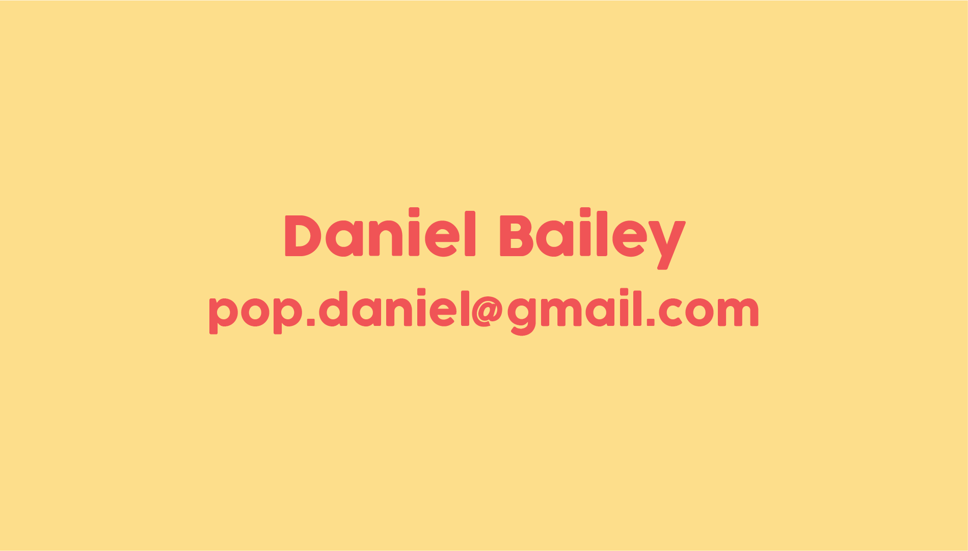
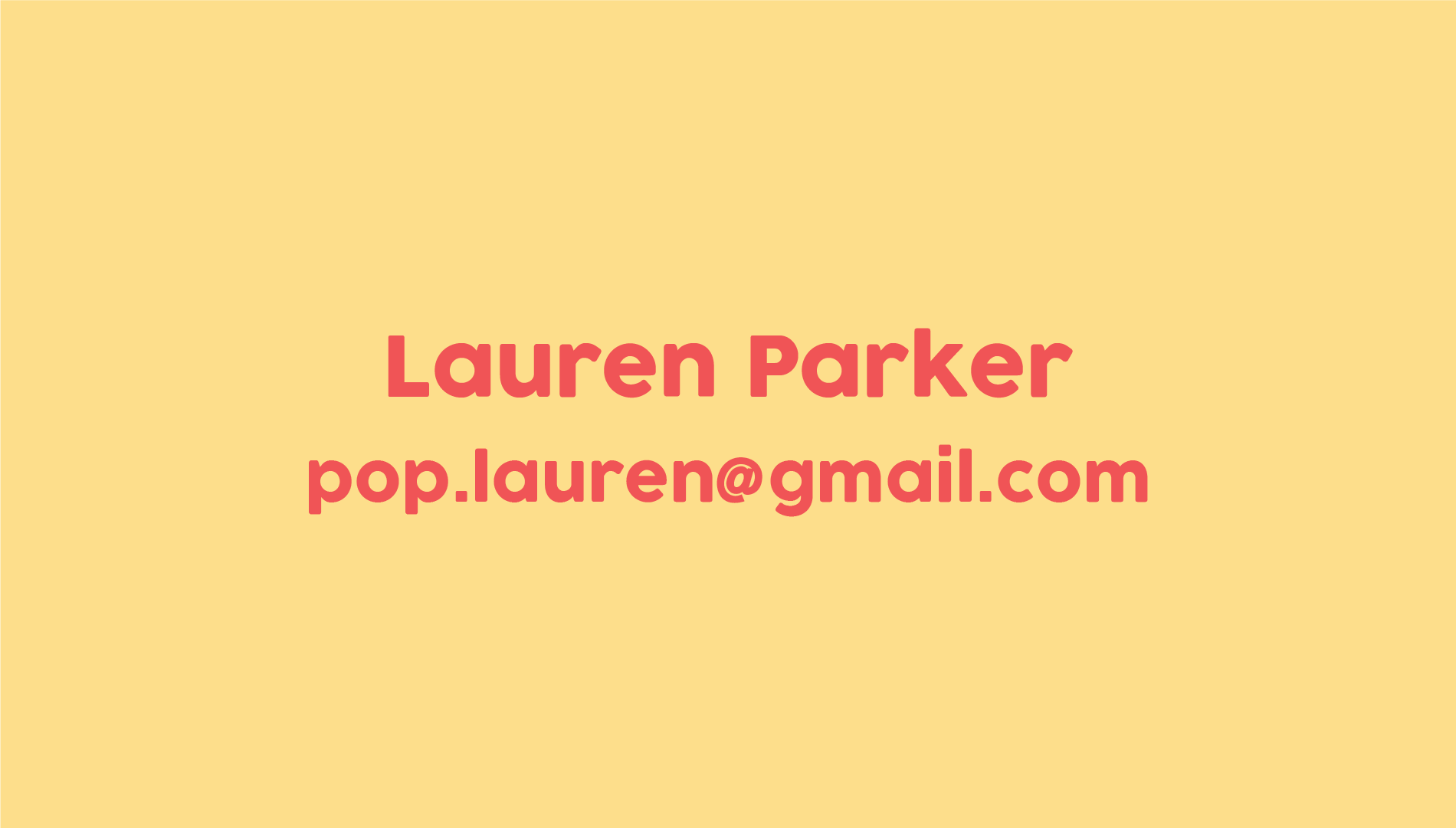
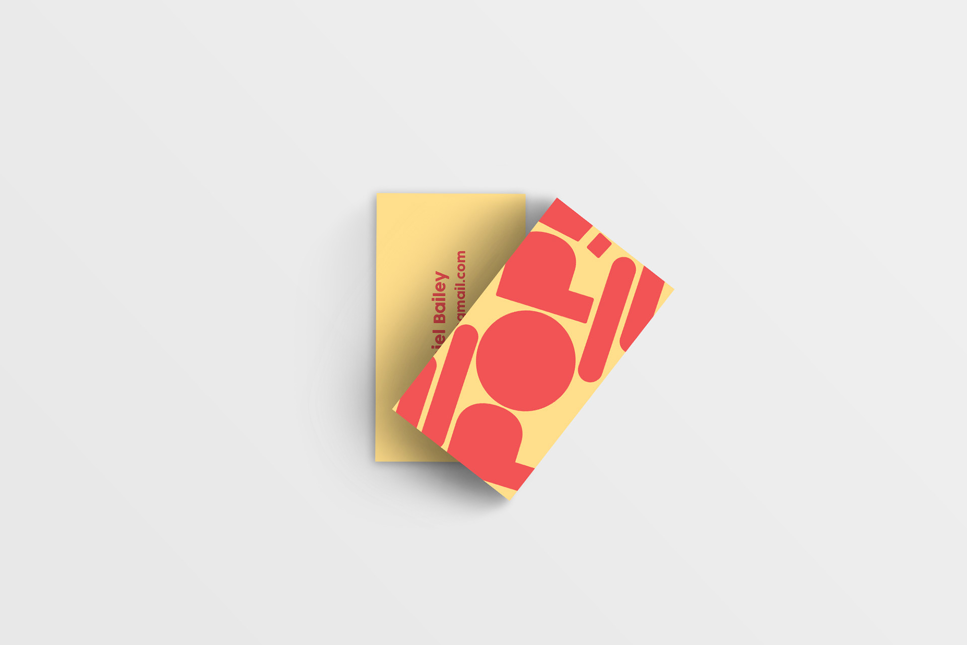
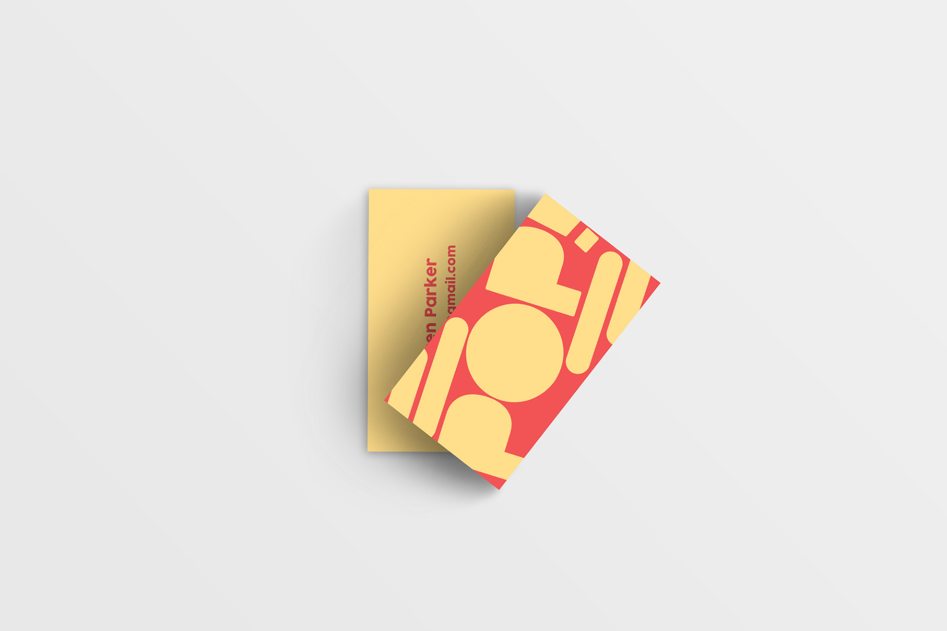
BUSINESS CARDS:
As a group, we agreed that the business cards should have a large dynamic design to help continue our brands aesthetic. I also thought it could be good to have some subtle variation between the cards for different members of the group, so I went with a flipped colourway on the front for some members. Two of us had one version of the cards, and two had the other variation. On the back, we had the email we would use if our brand was fully realised so people could contact us. If I was to re-do these designs I would add more information, like our website and phone numbers so people could get in contact more easily.

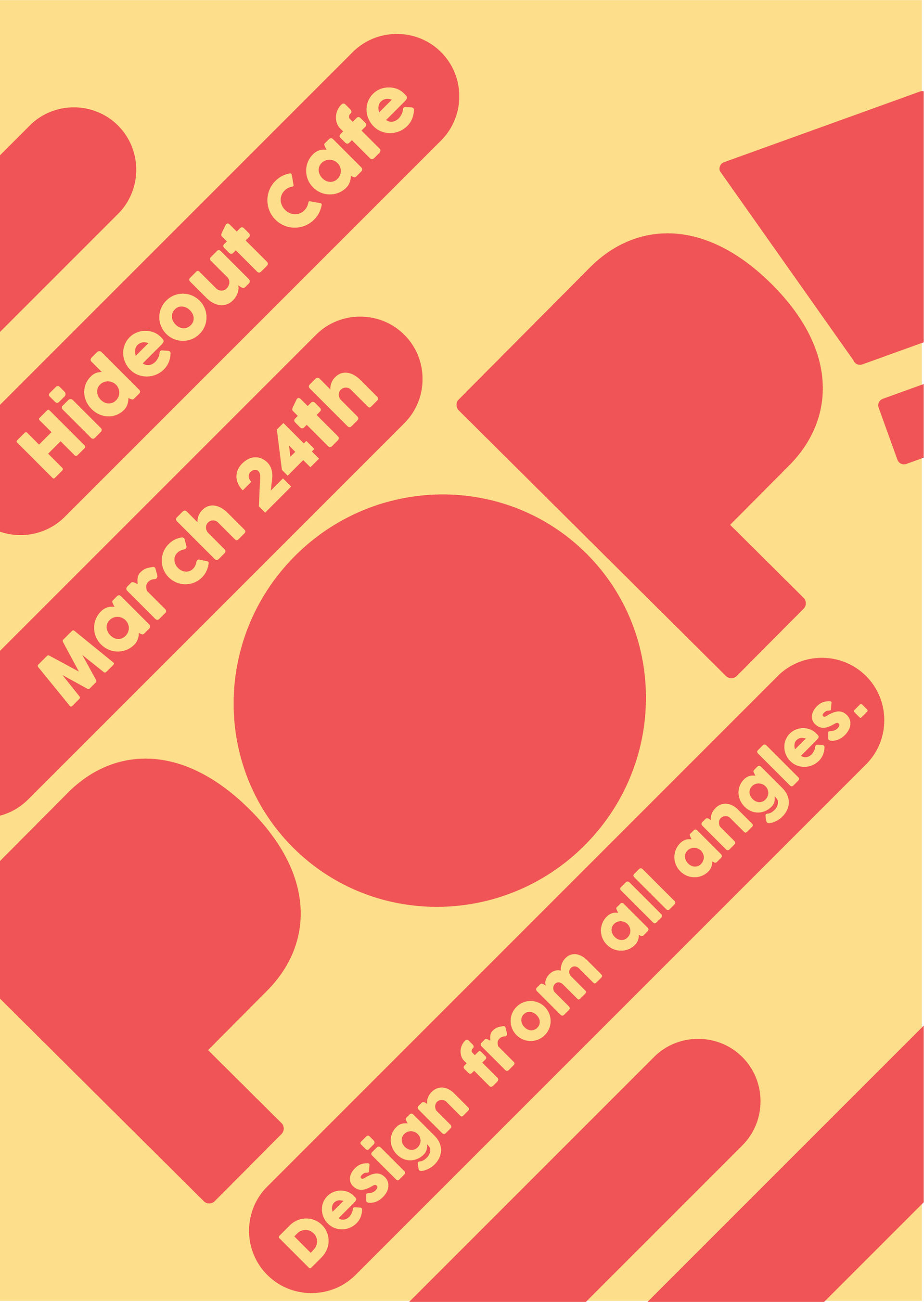
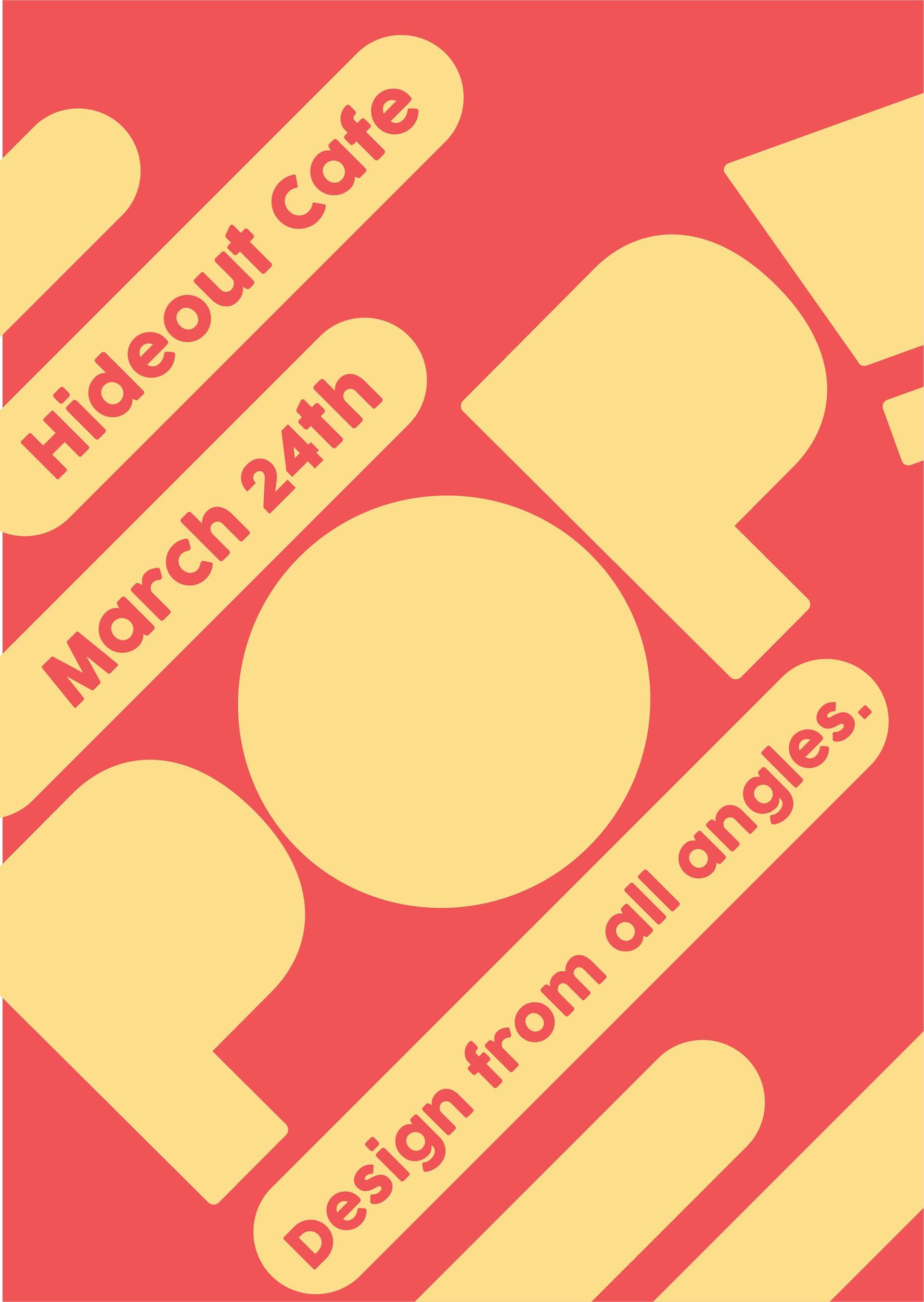
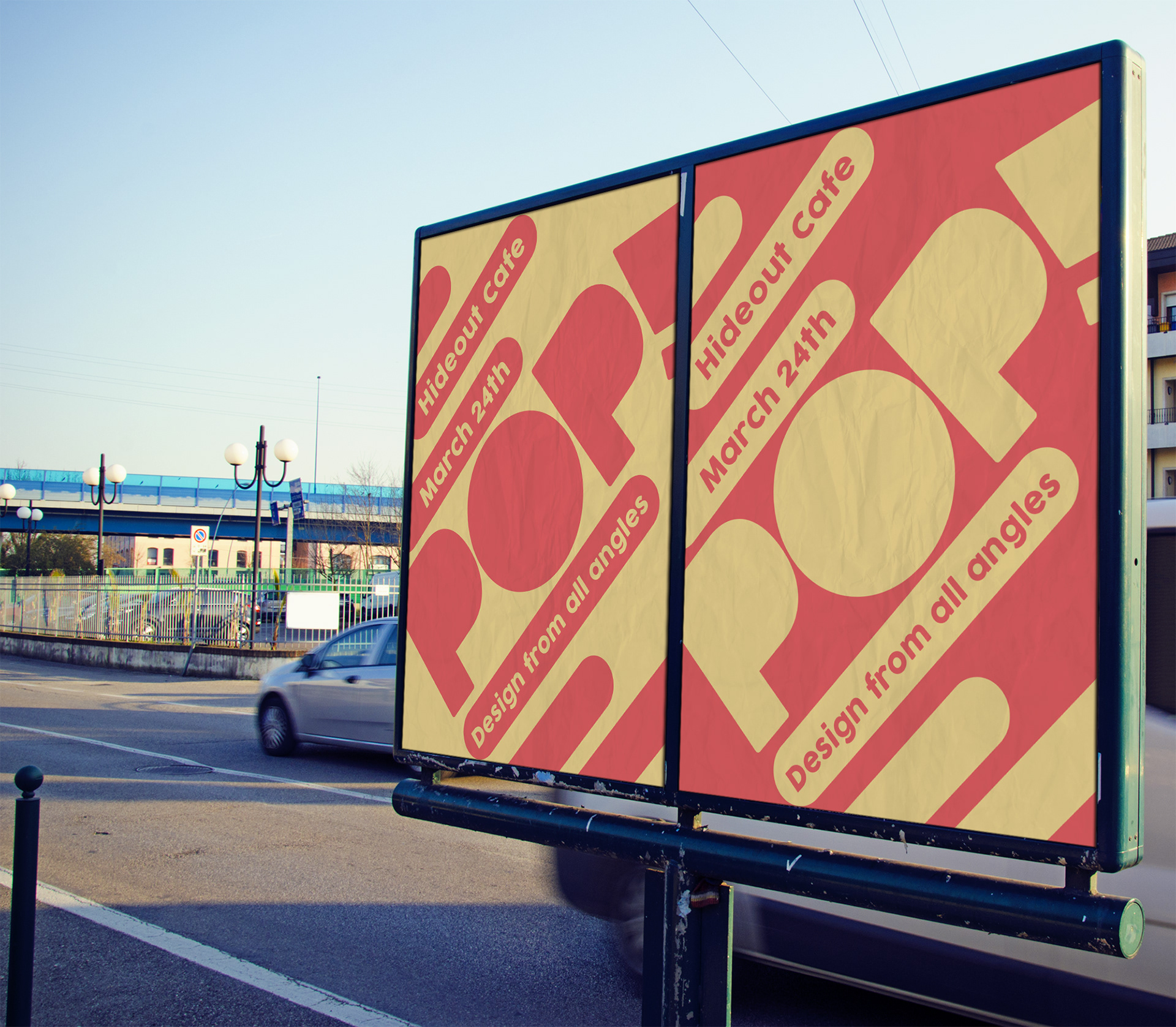
POSTERS:
The final item I designed for our collaborative project POP! were these promotional posters for our final show. We needed these to have important information, like the date and location for our show. I made sure the design for these matched our dynamic and friendly brand identity so that people could easily recognise our brand. I also added our brand tagline into this, which was also reflected in the design itself with the design elements coming in at different angles.