

PENTY-LOWATH
Client Work
Brief:
Penty-Lowarth is a holiday cottage located near the coast, in Cornwall. It is rented out to guests during the year and the client needed this re-brand to help advertise the cottage to more people and give it a new identity. This included designing a new logo, business cards, postcards and templates for documents.

LOGO:
This is the logo I designed for the client. The client had mentioned that the name "Penty-Lowarth" translates to "Cottage in the Garden". This, combined with the setting of the cottage being in a garden, is where the inspiration for this logo came from. The client said they wanted the logo to somehow convey the idea of the cottage surrounded by nature to the viewer. I designed this logo to have the cottage in the middle, surrounded by leaves growing around it to symbolise it being surrounded by nature. The illustration of the cottage is also unique to the cottage itself, with the cottage having the same three windows as the illustration.
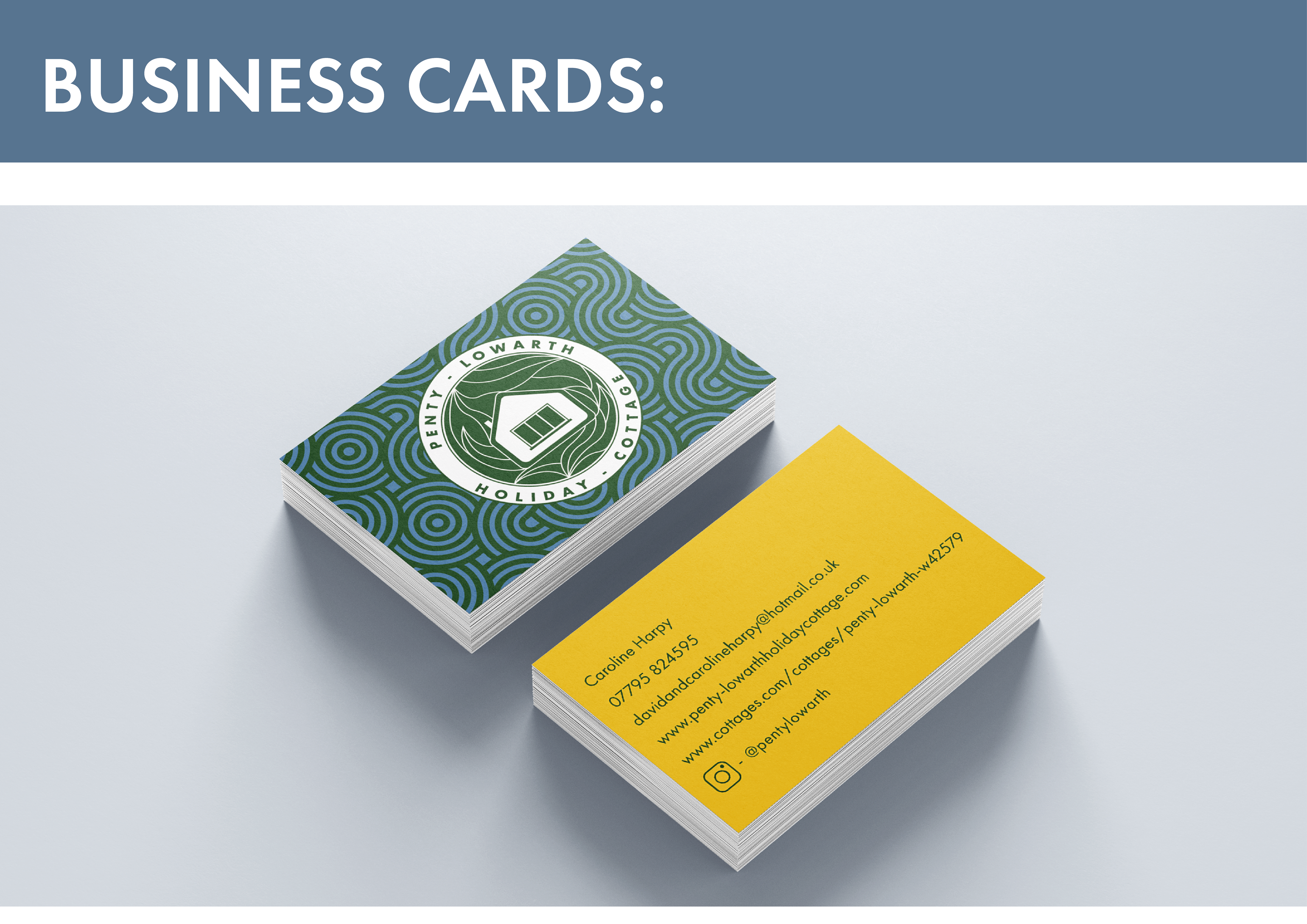
BUSINESS CARDS:
The rest of the deliverables needed to resemble the style of the logo in order to create a consistent aesthetic for the cottage. So, once I had designed the logo, I then went on to design the remaining deliverables. For the business cards I created a pattern background to resemble both the Celtic culture of Cornwall, and the waves of the ocean due to the cottage being in a coastal area. The blue and green colourway for the front reflected this idea of the ocean. For the back, my client wanted a contrast in colours compared to the front so they went with a warm yellow along with green text to resemble the colours in the cottages garden.
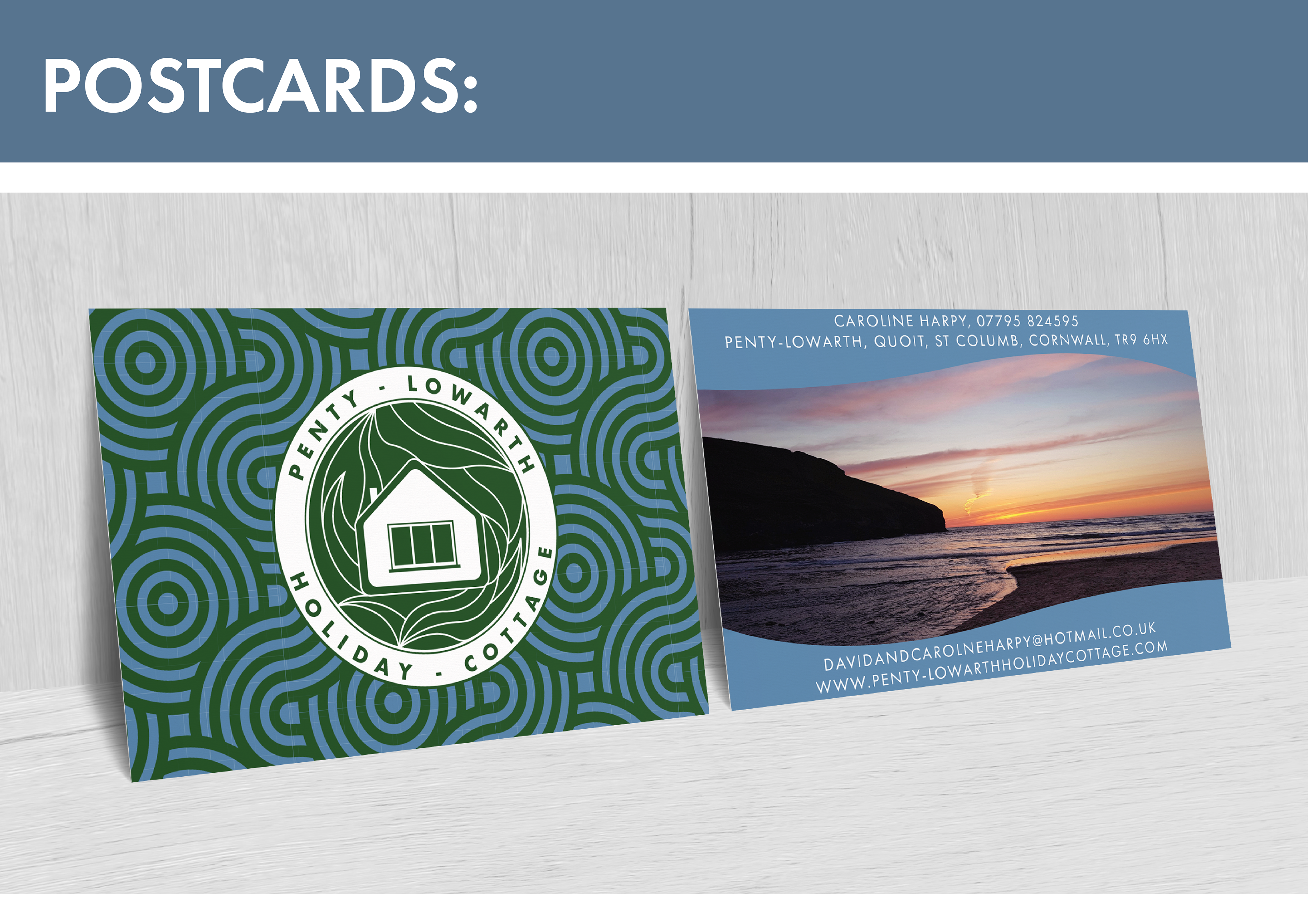
POSTCARDS:
For the postcards, my client wanted something similar to the business cards, but with photography on the back instead. To keep a consistent identity and aesthetic, I used the same design as the front of the business cards for the front of the postcards. For the back, the client provided the image which I then edited slightly in Photoshop to bring out some of the warmer tones. The client wanted a wavy design on the back to convey the idea of the waves of the coast, with the blue colour also complimenting this concept.

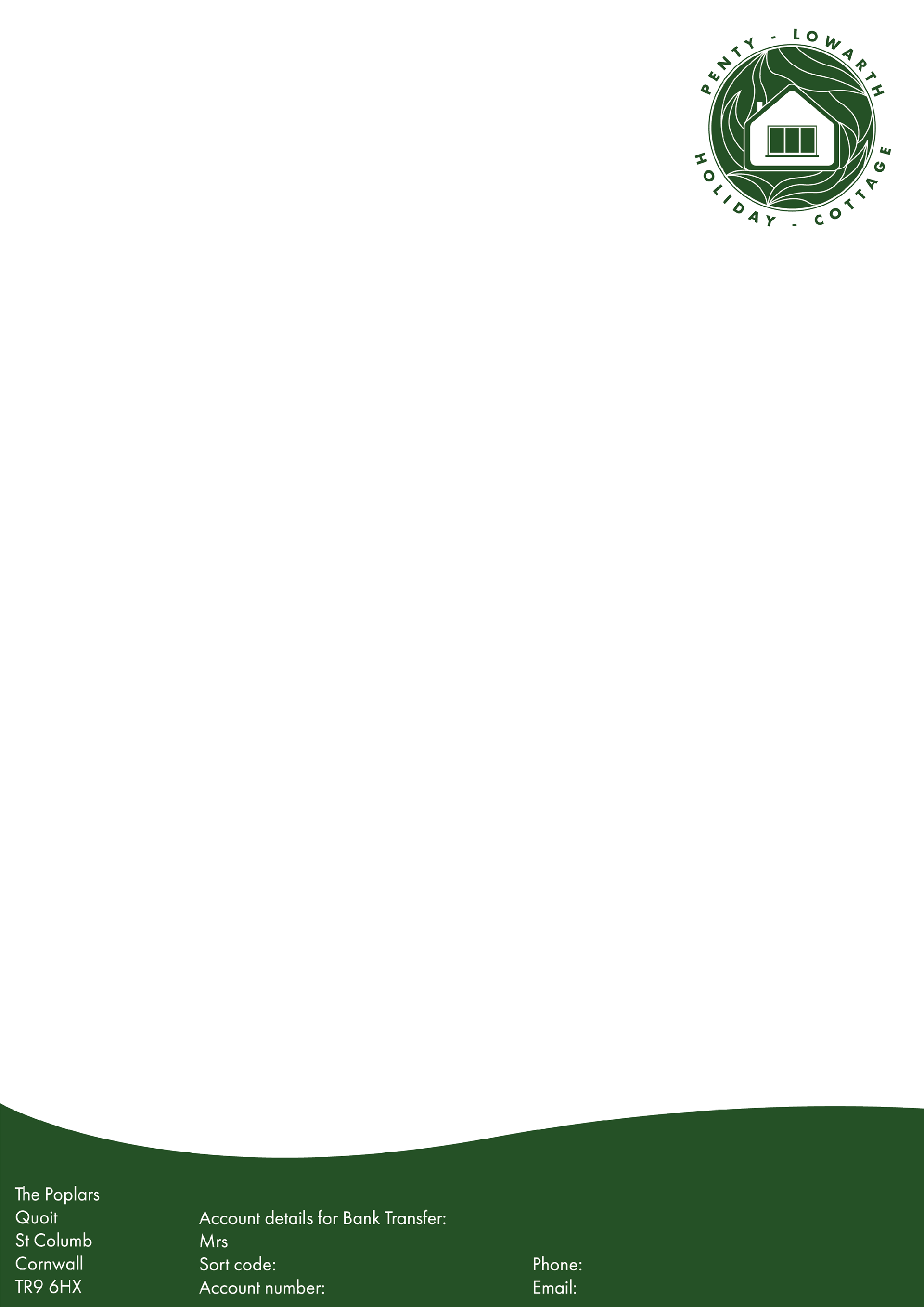


TEMPLATES:
My client also wanted three templates made. They needed one with their bank details they could send to customers, one with just their email and phone on and one blank one to applied to informative documents. For these, I continued with the curved design from the postcards, and used the same green as in the logo to keep the designs consistent.
Personal information (bank details, phone number, etc) have been censored in these images.