NATURES PATTERNS:
ISTD Brief at University of Portsmouth (2020/21)
BRIEF:
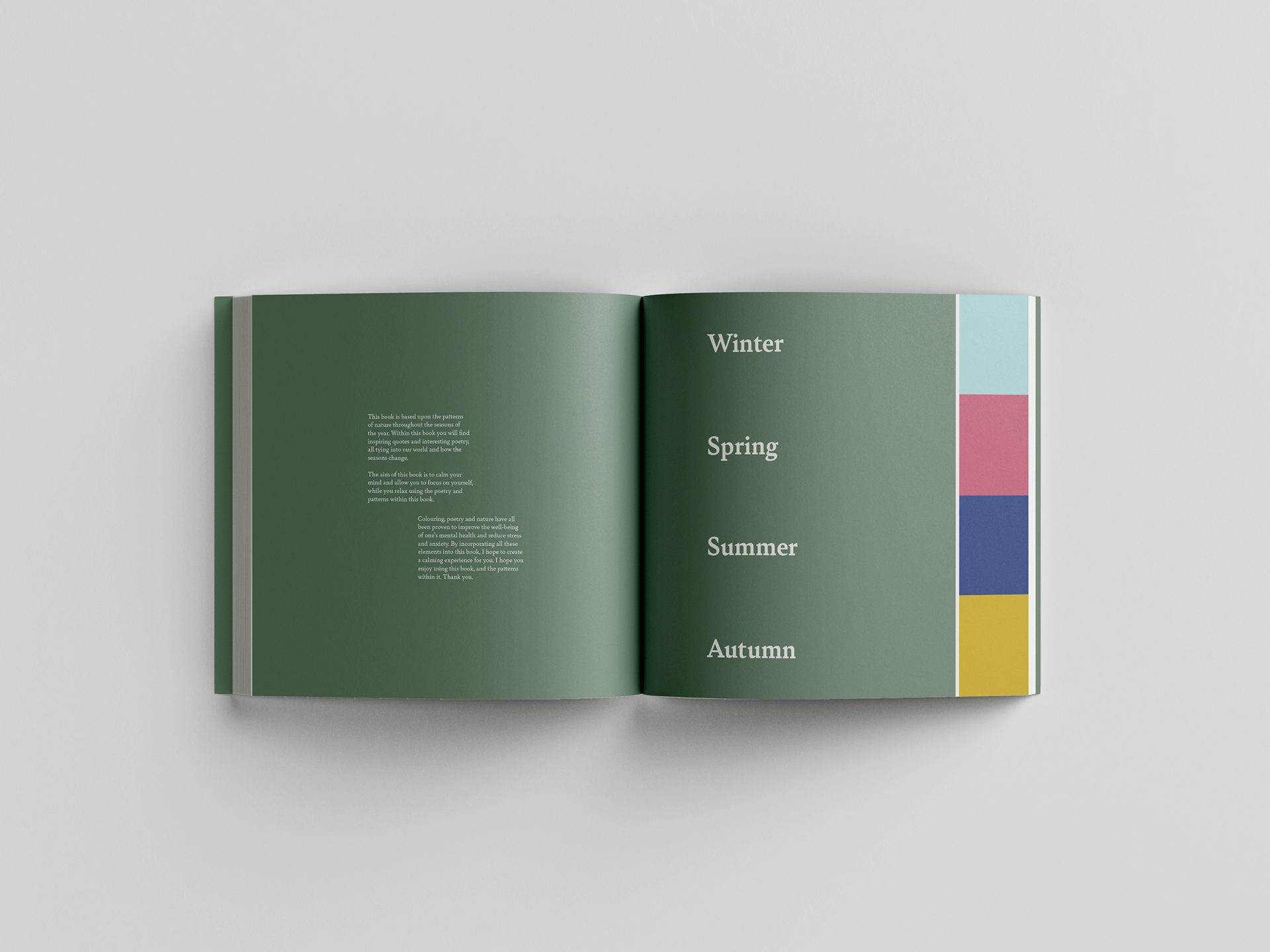
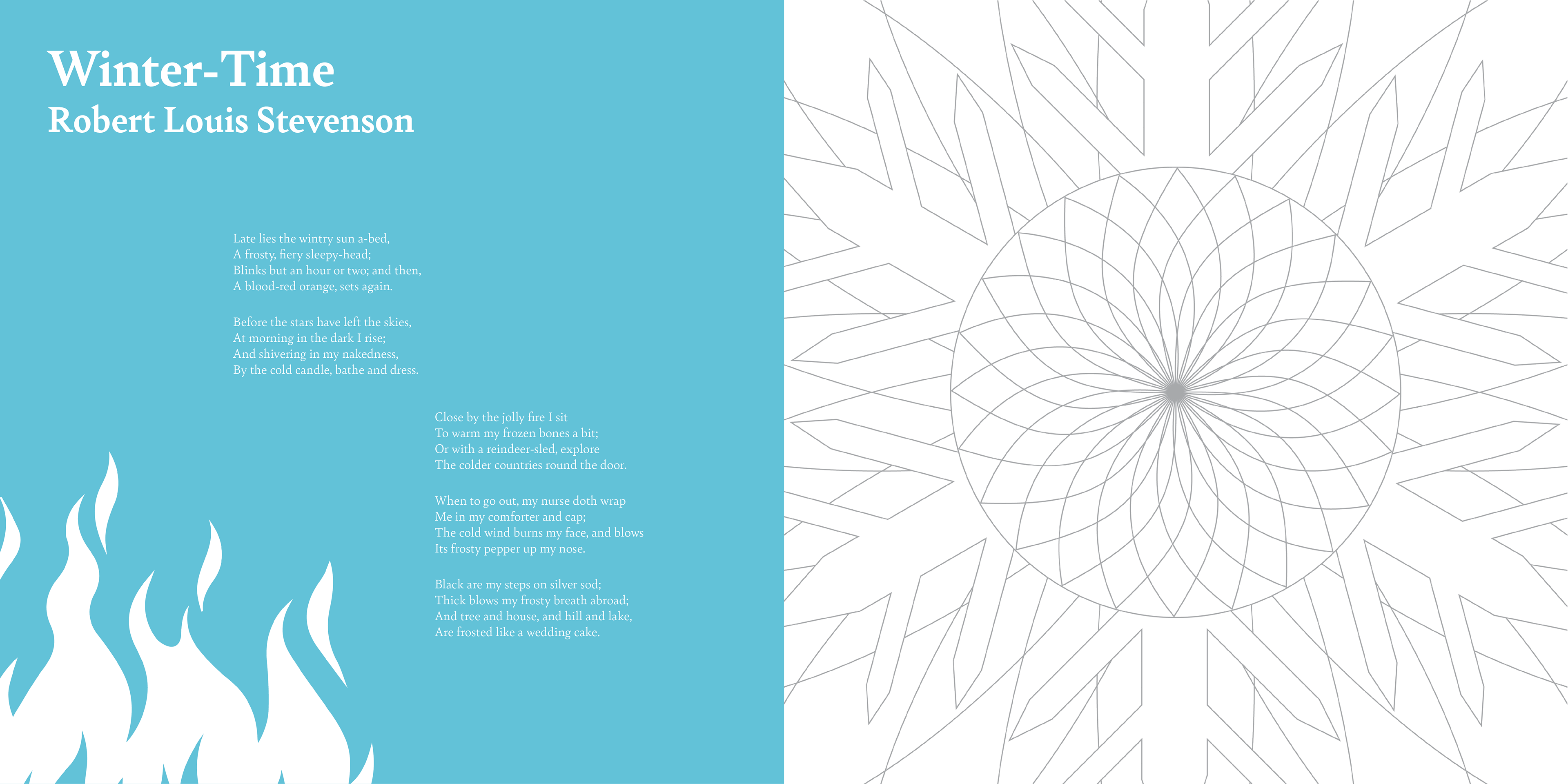
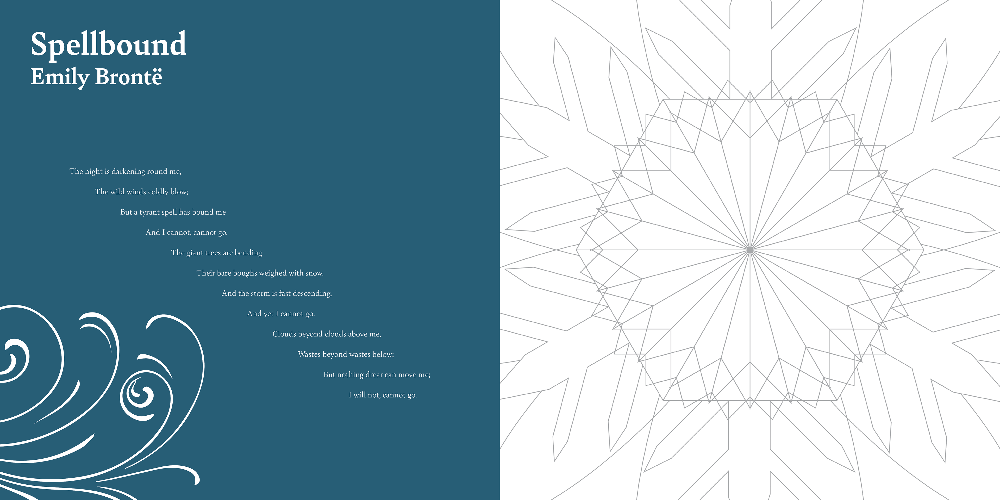
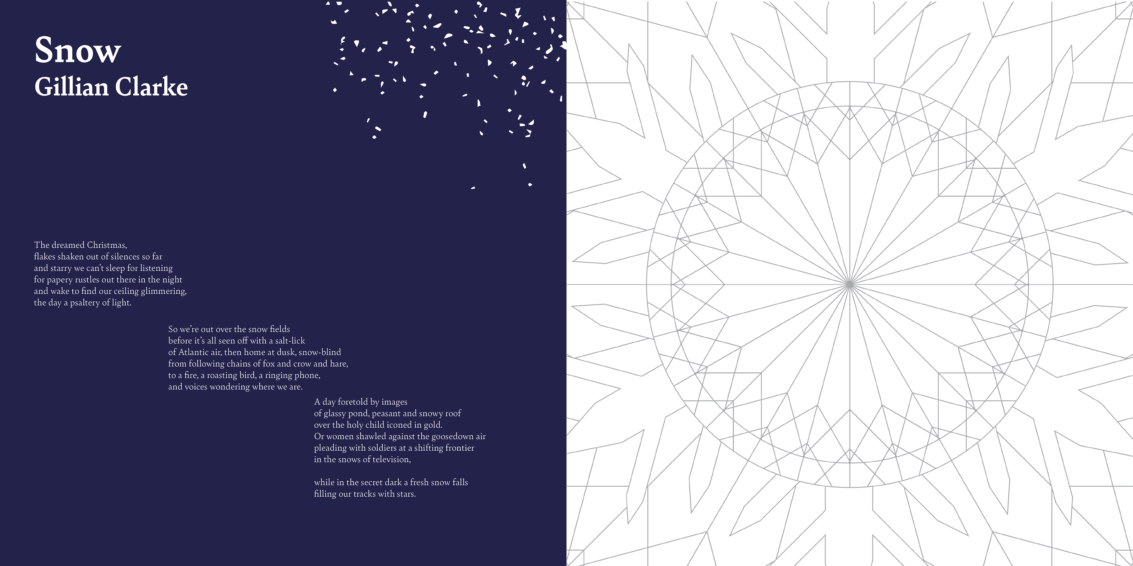
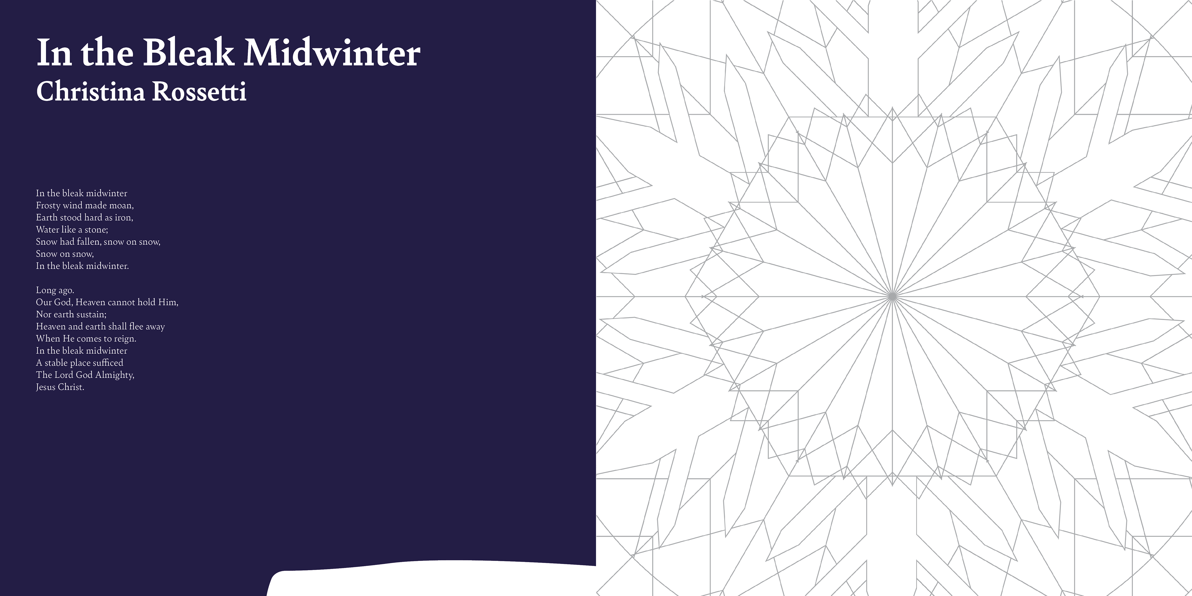
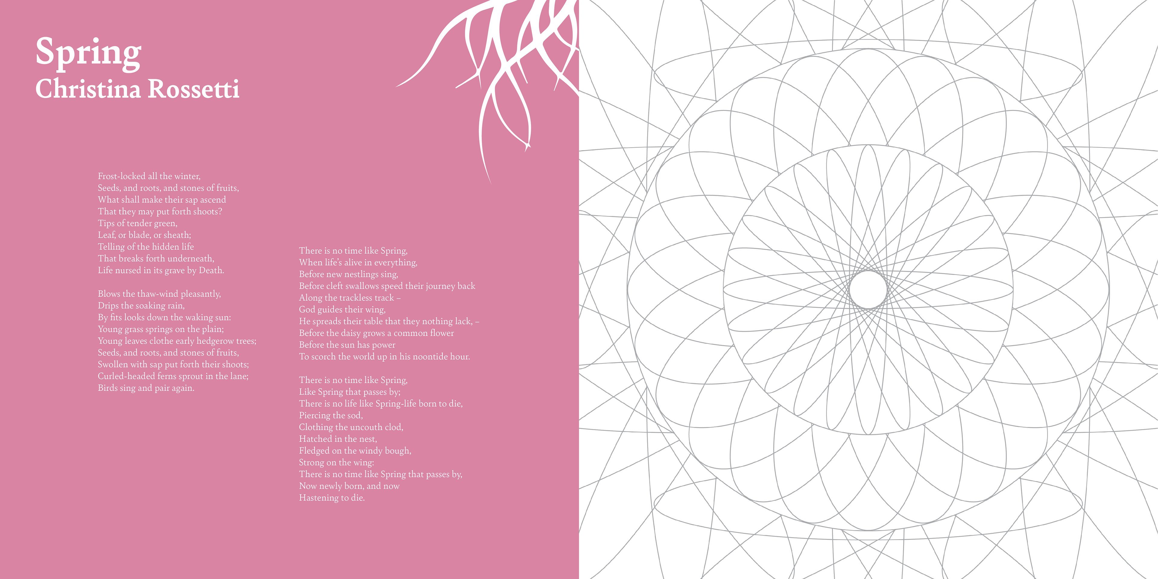
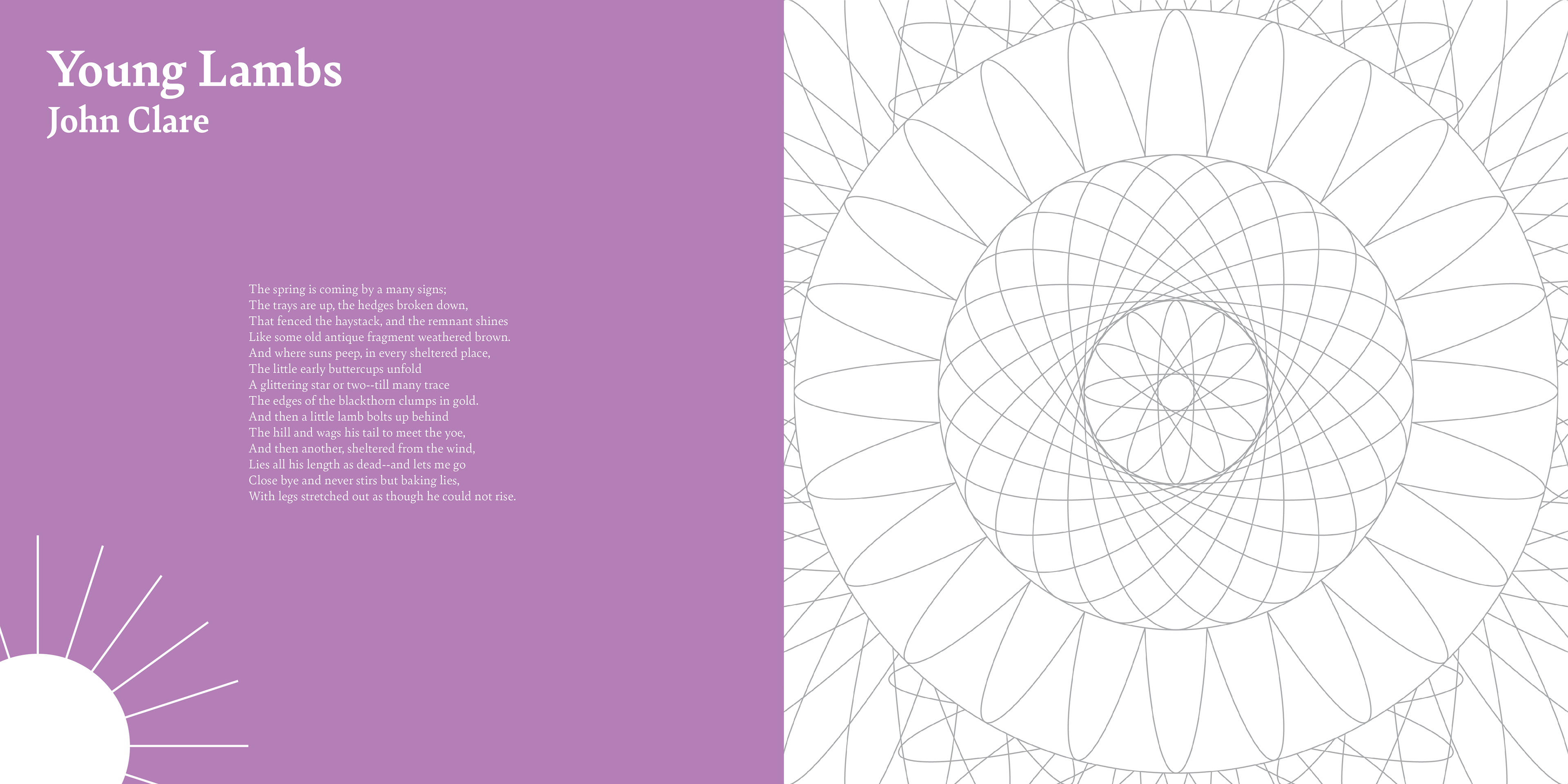
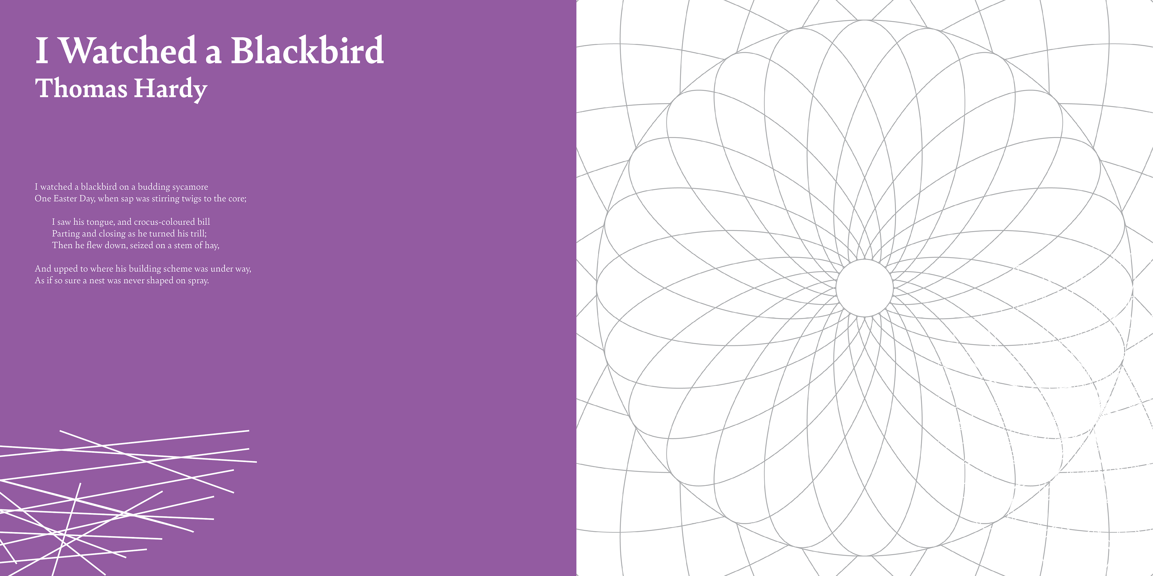
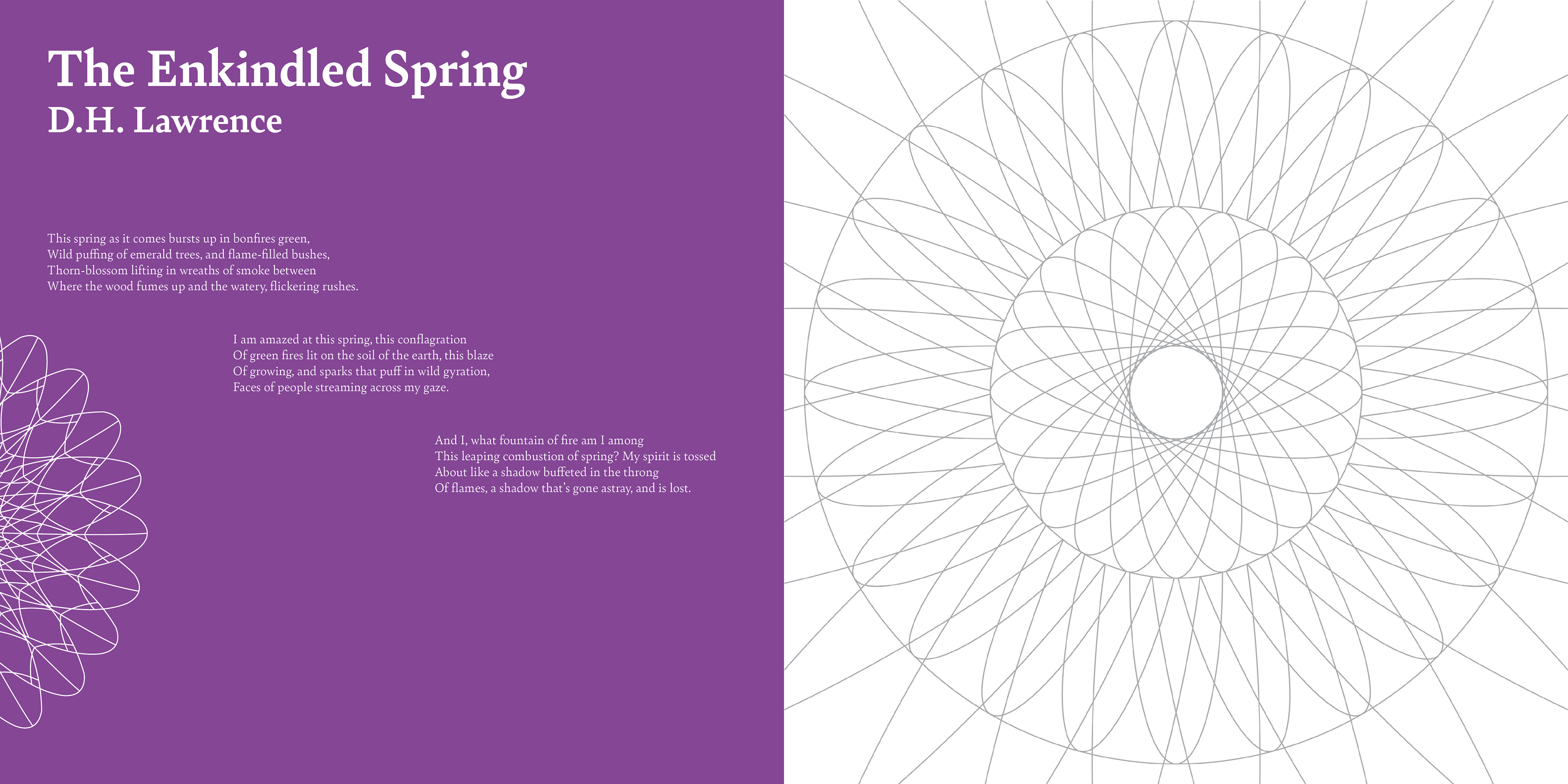
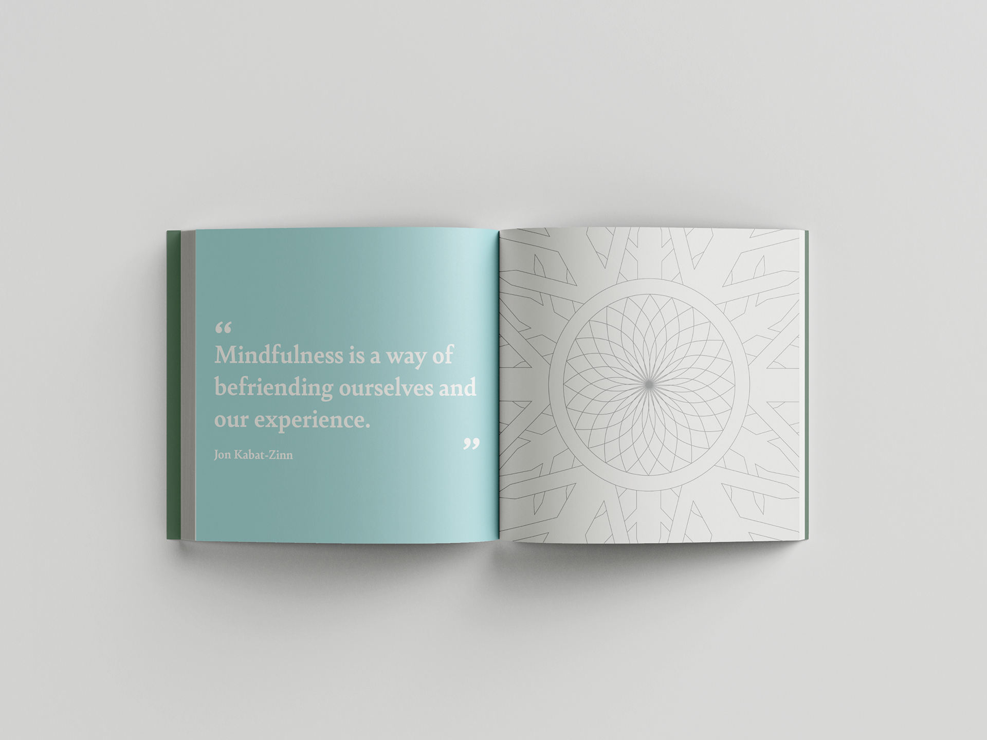
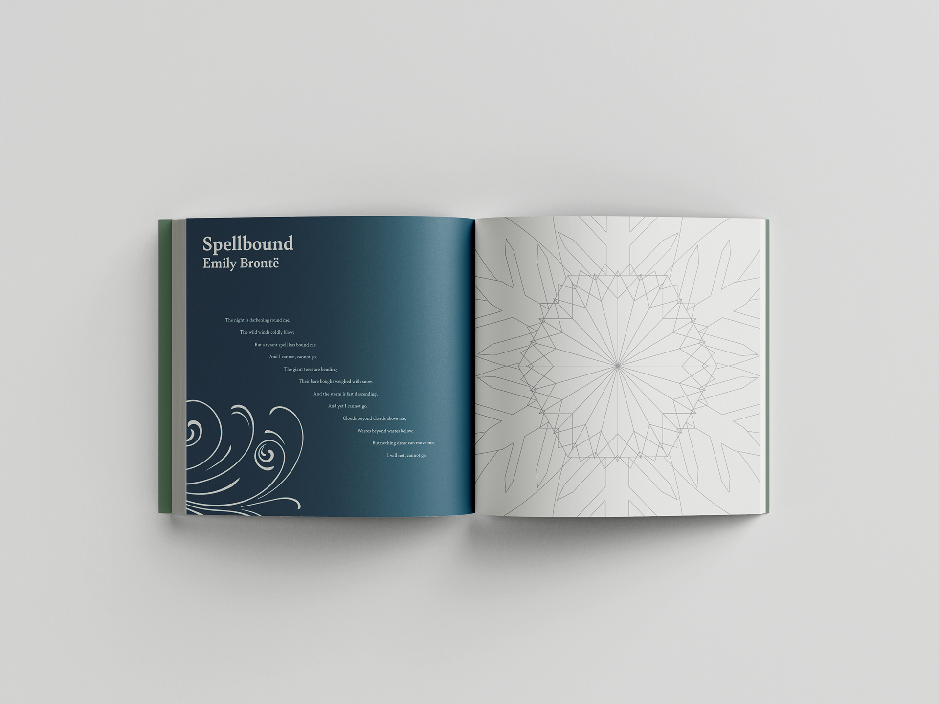
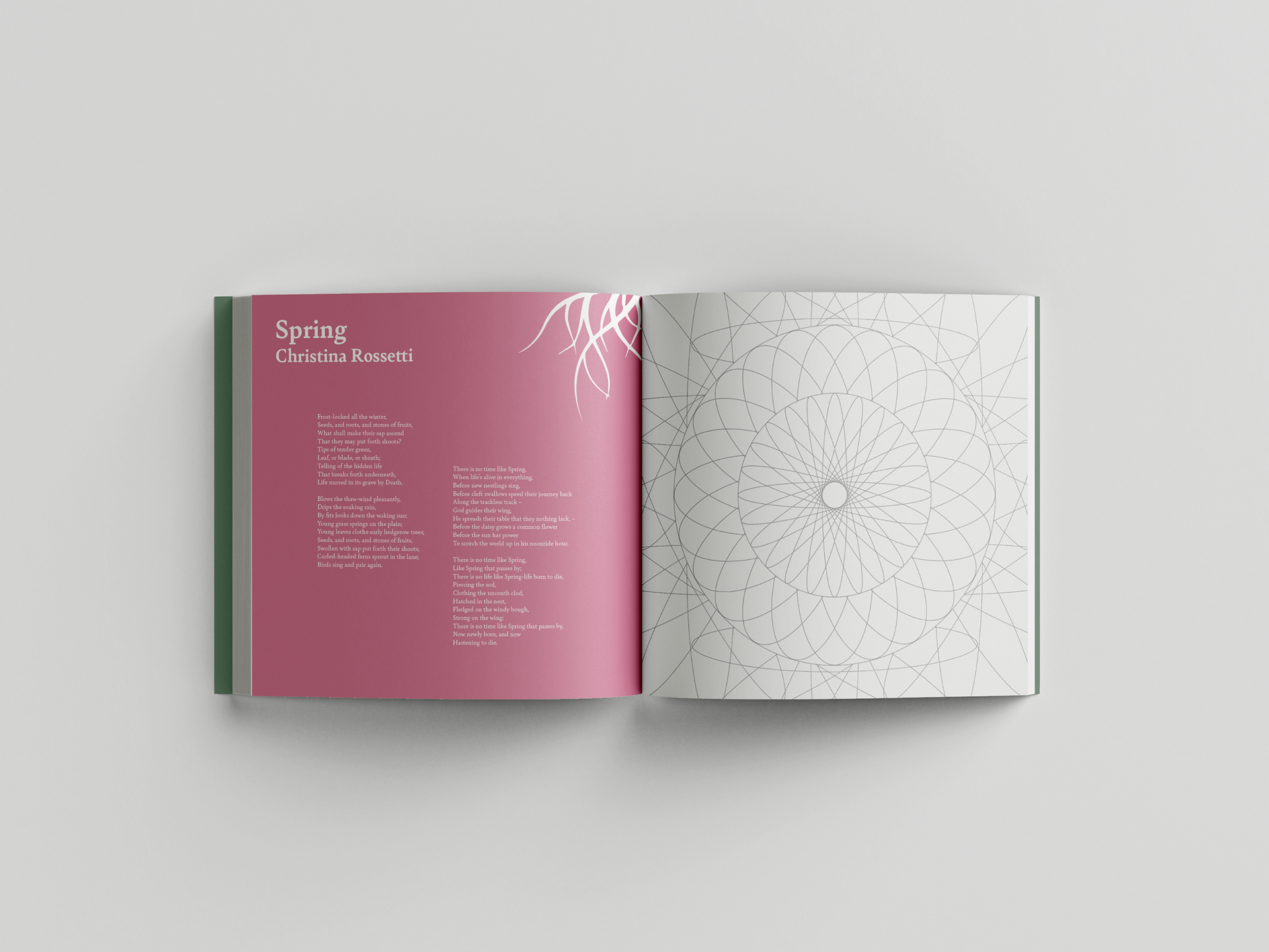
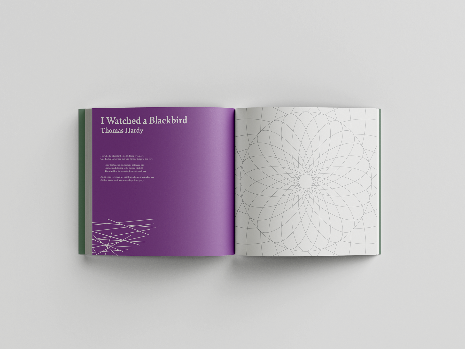
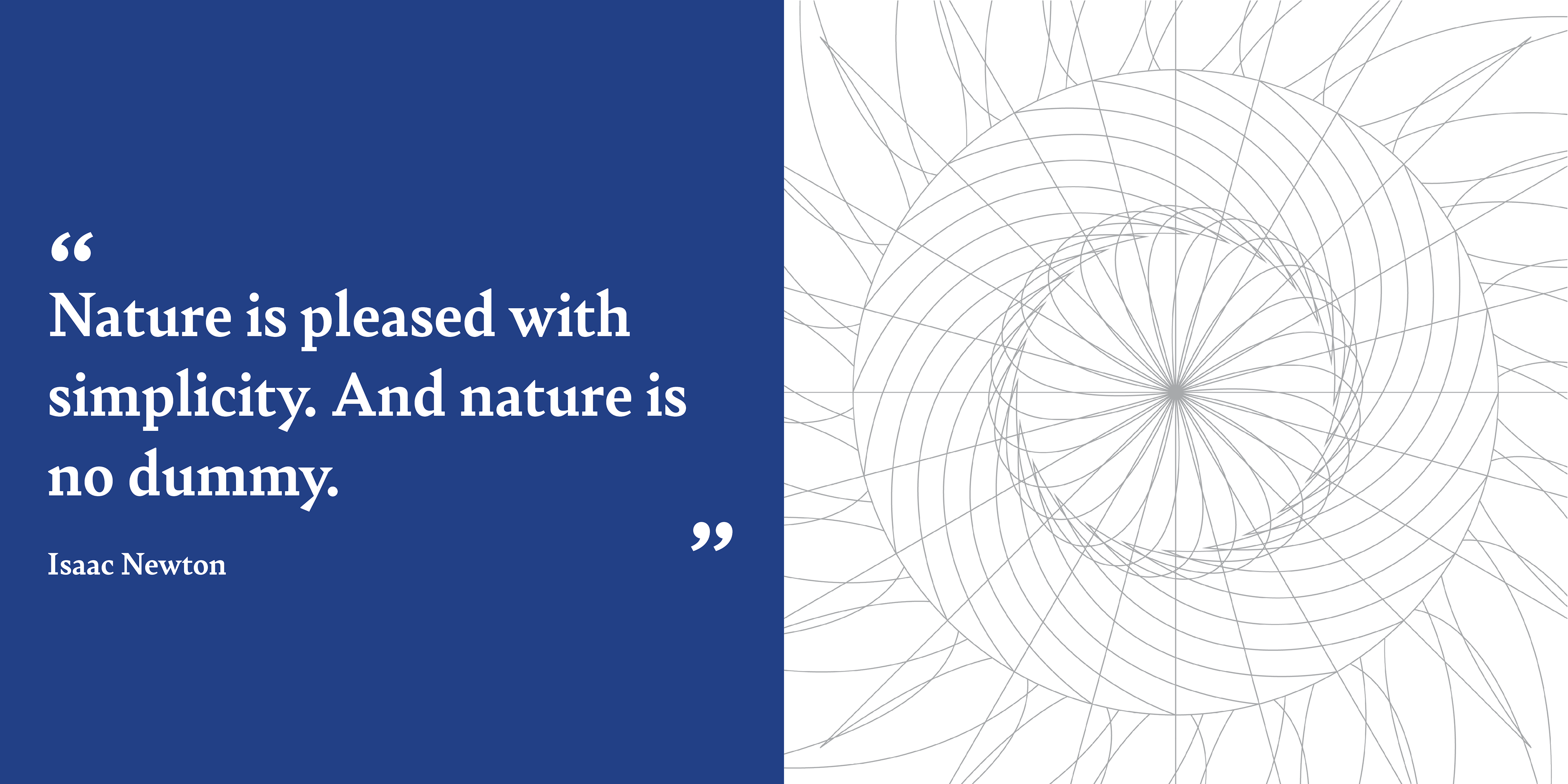
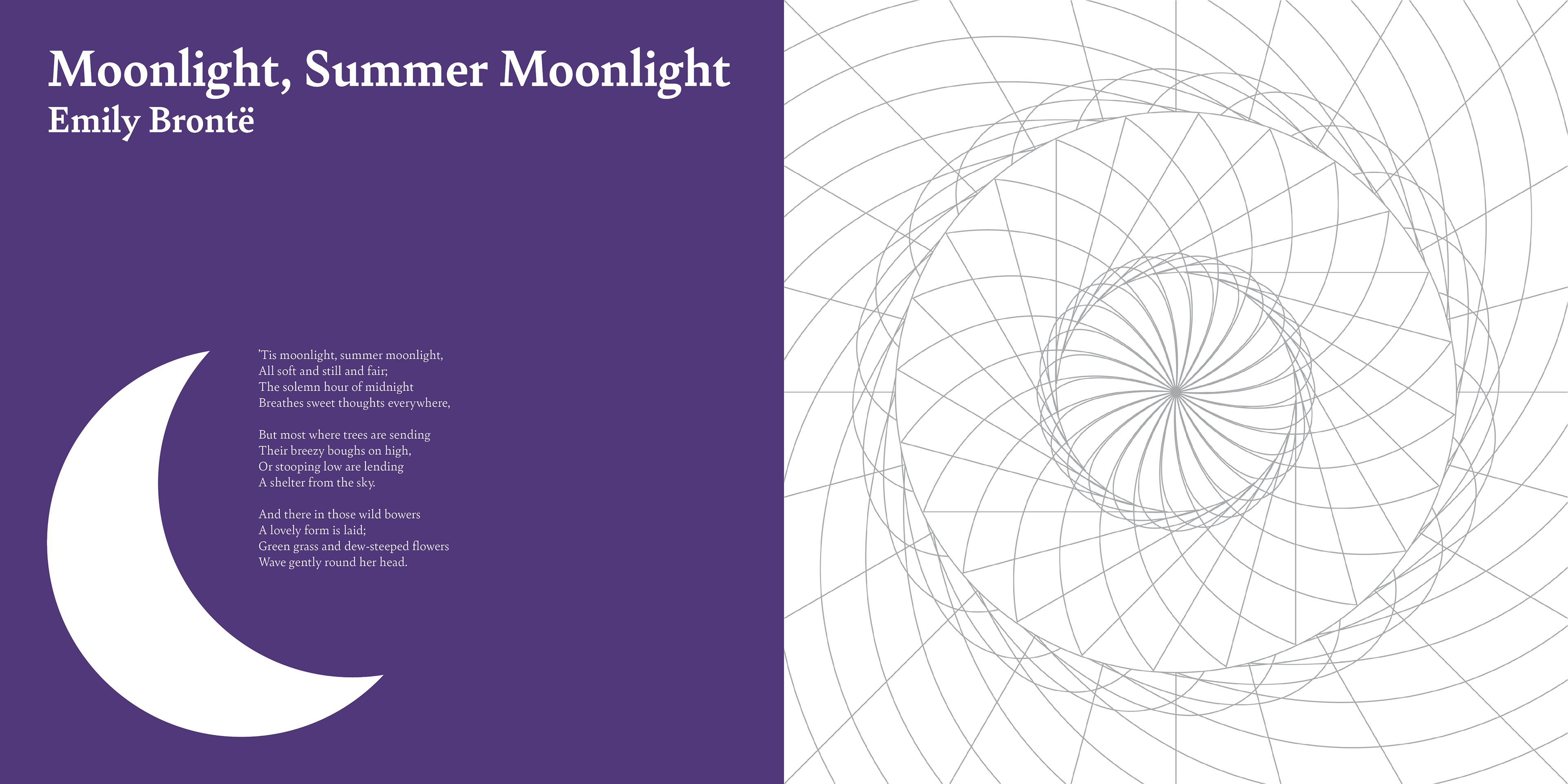
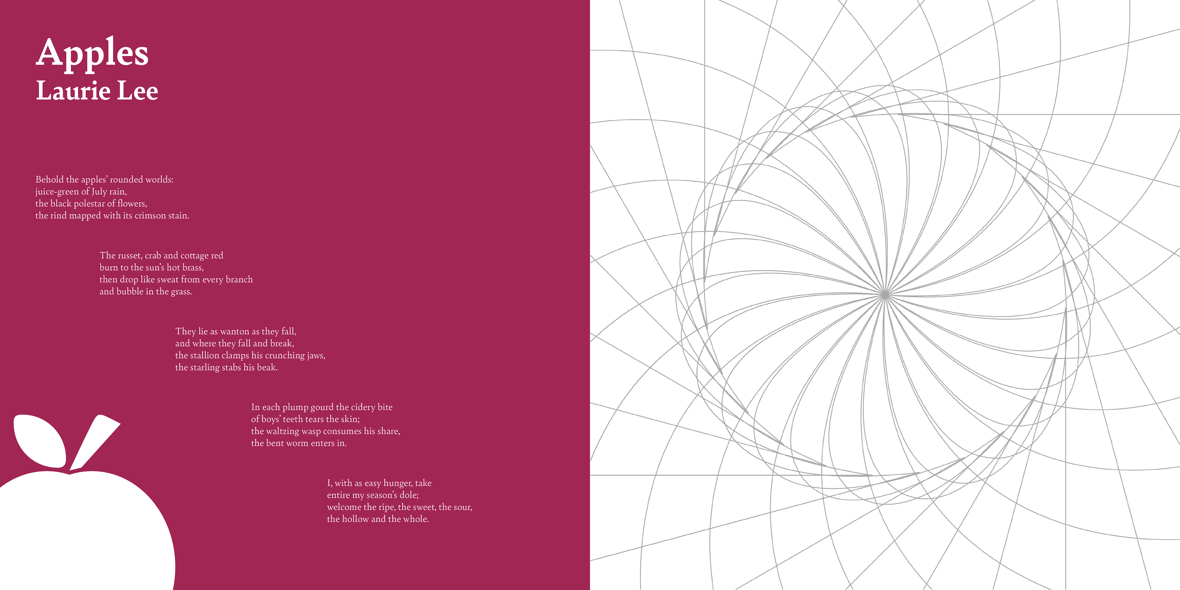
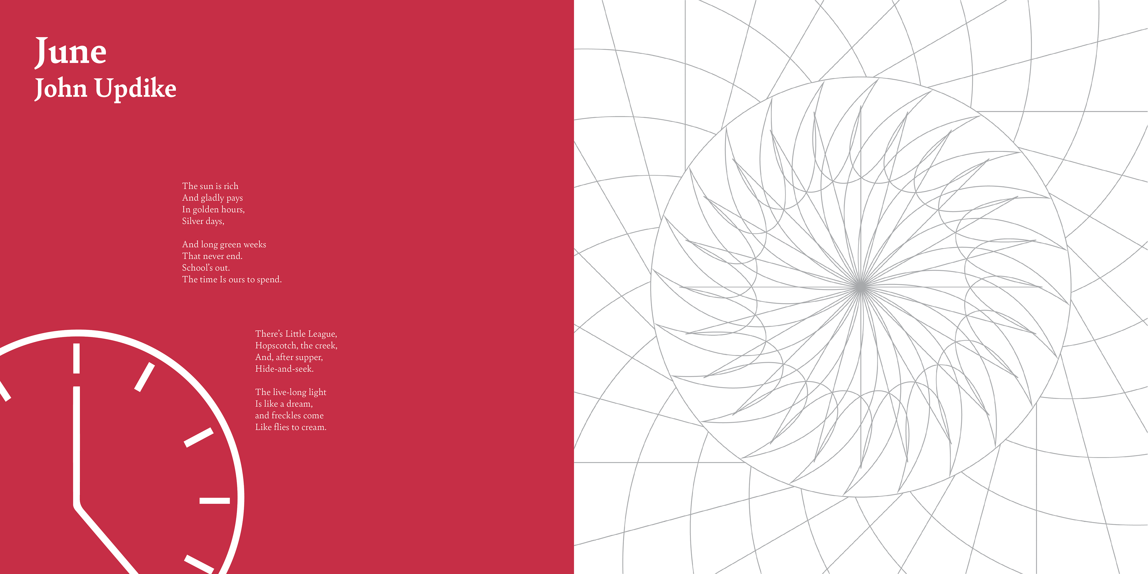
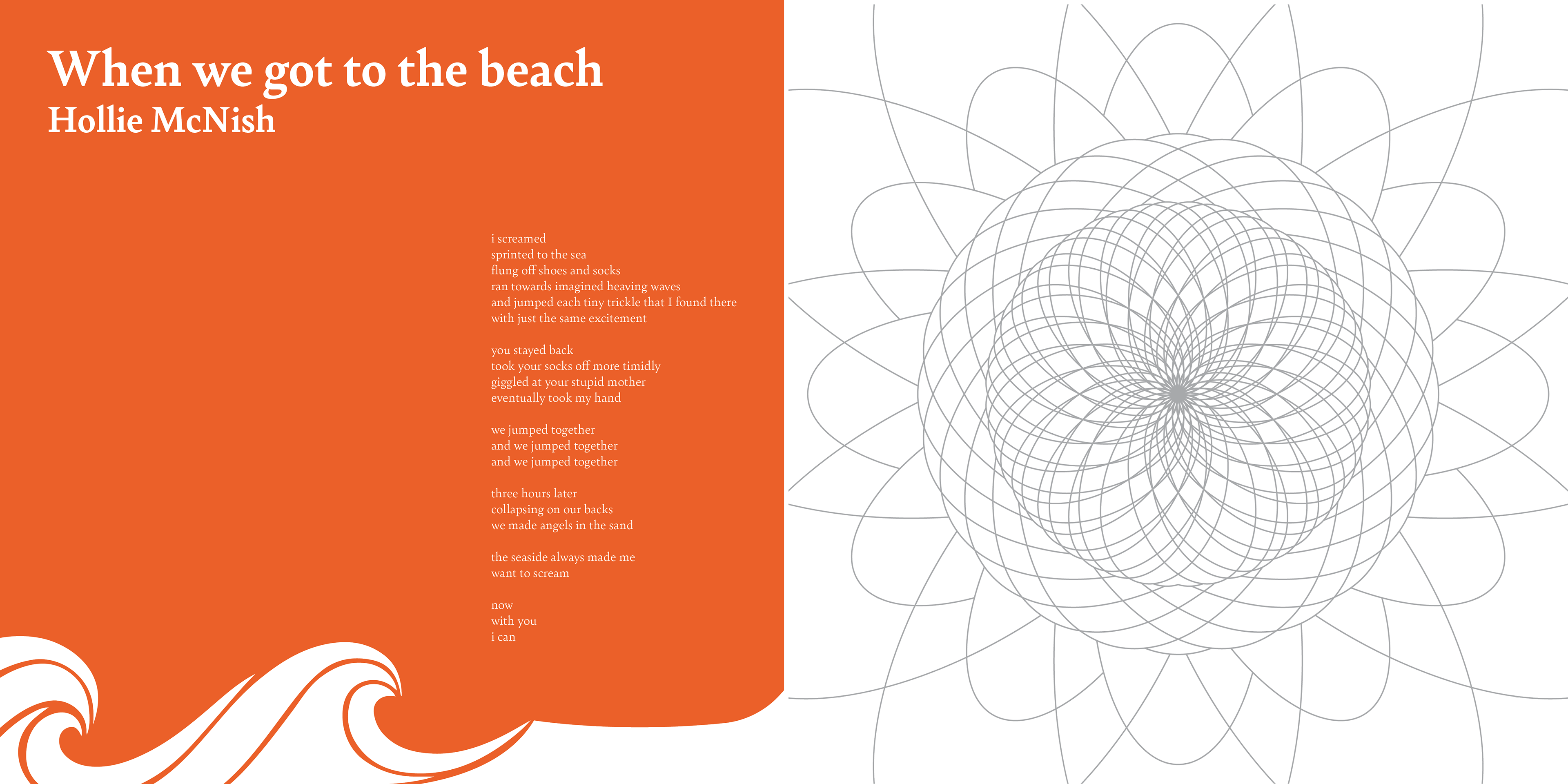
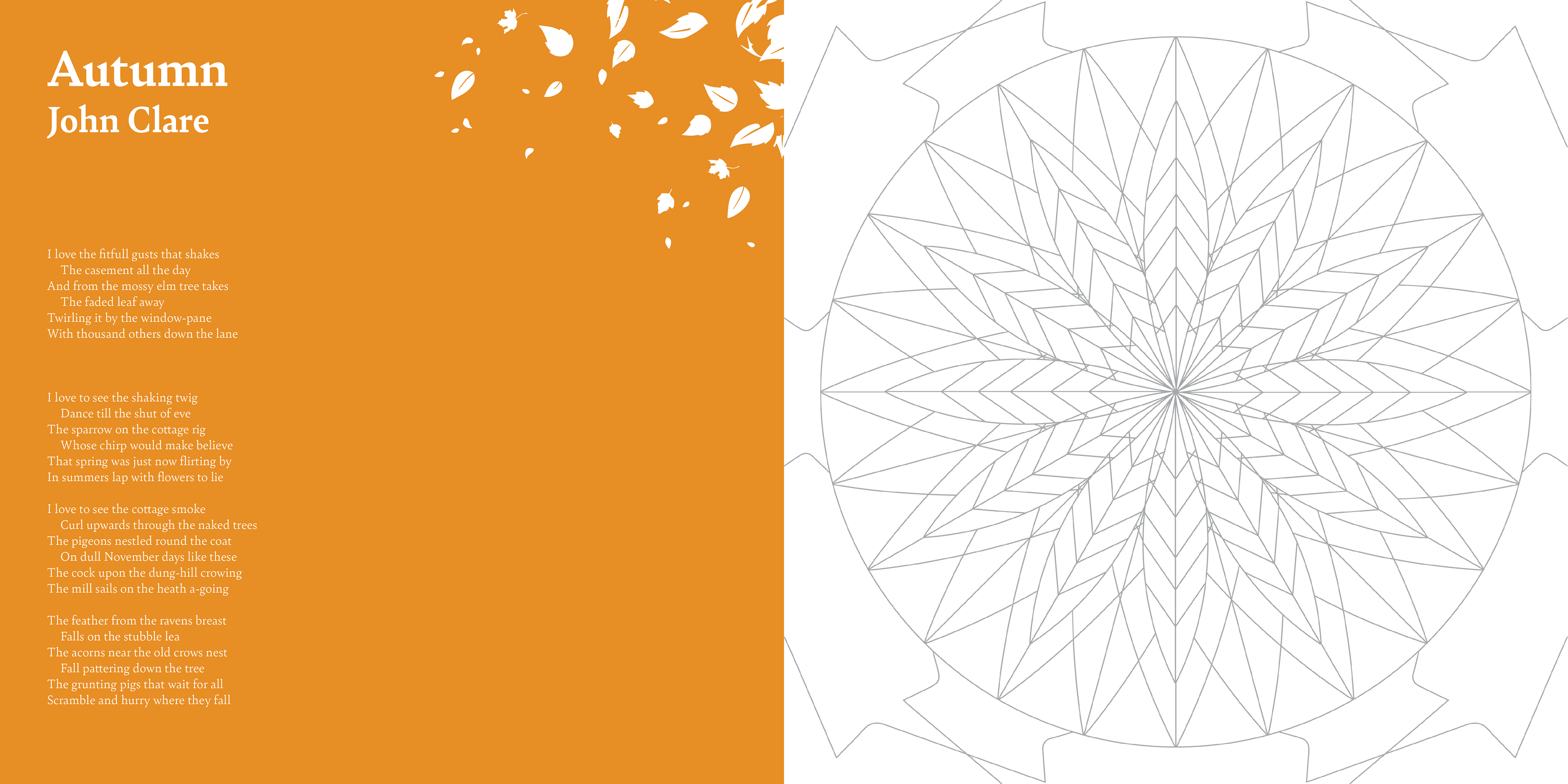
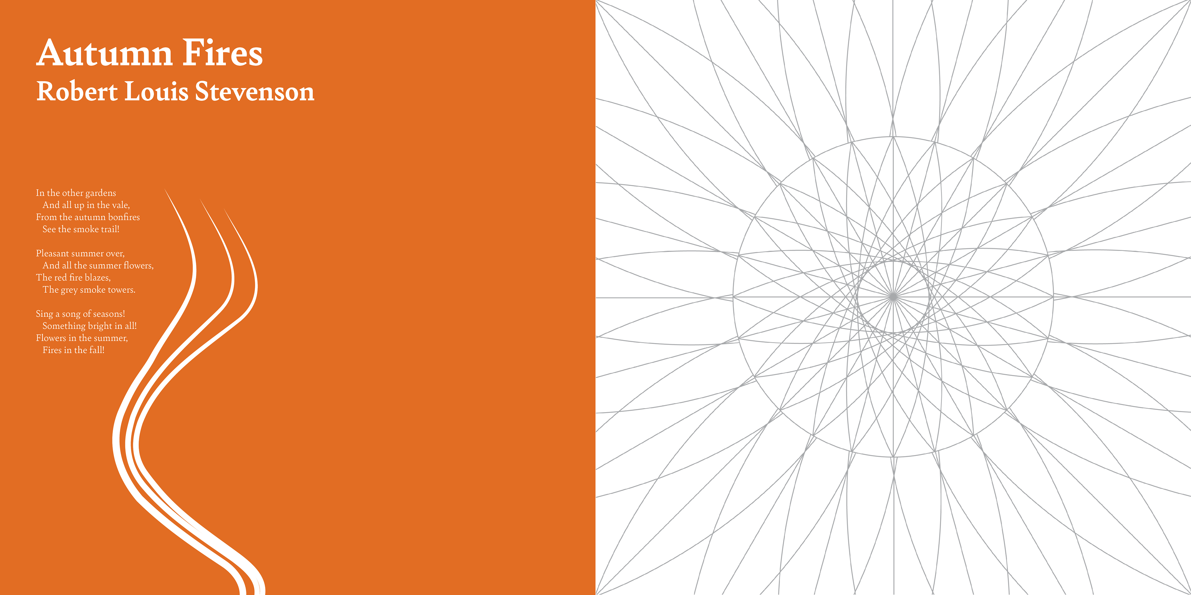
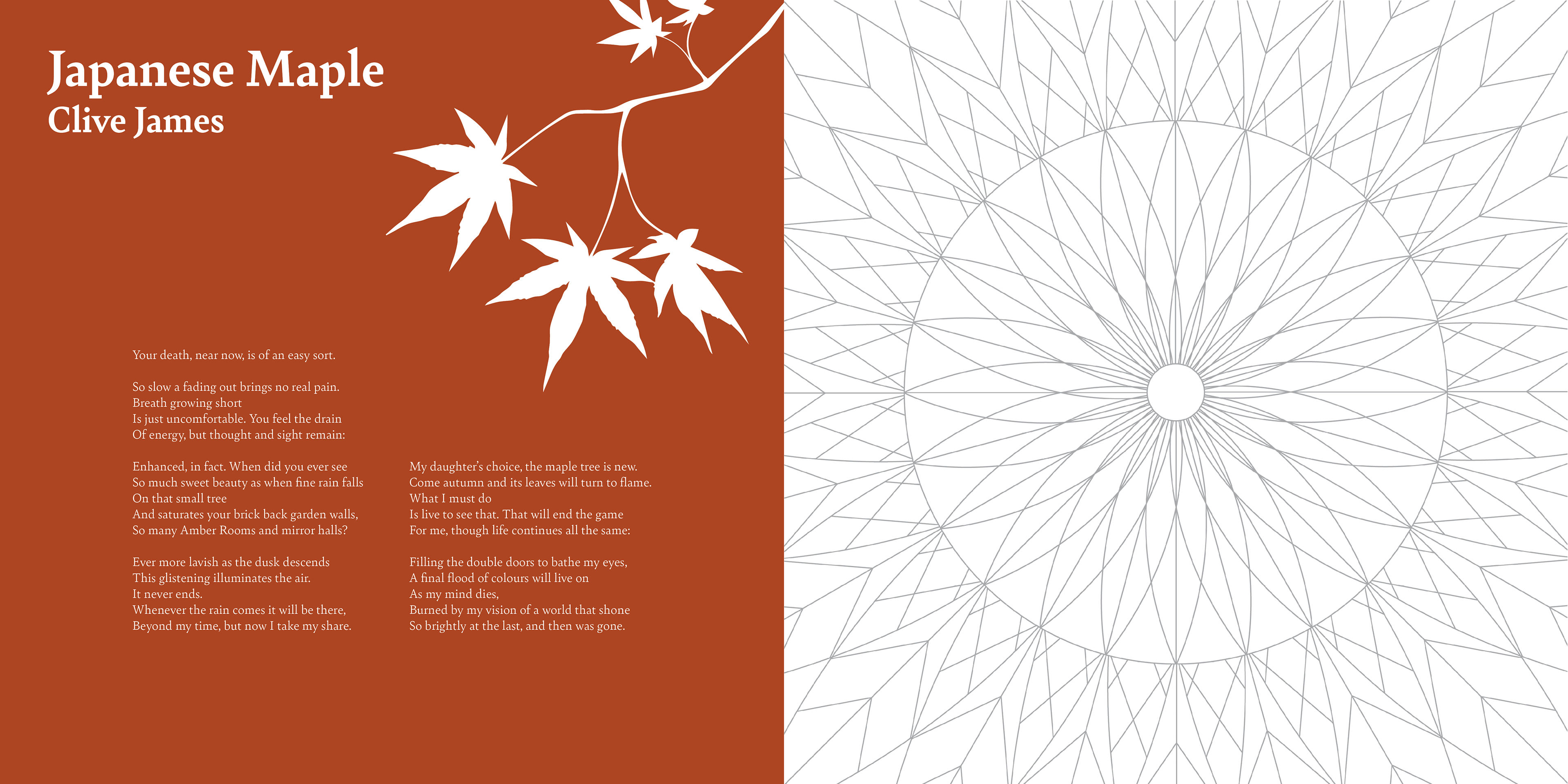
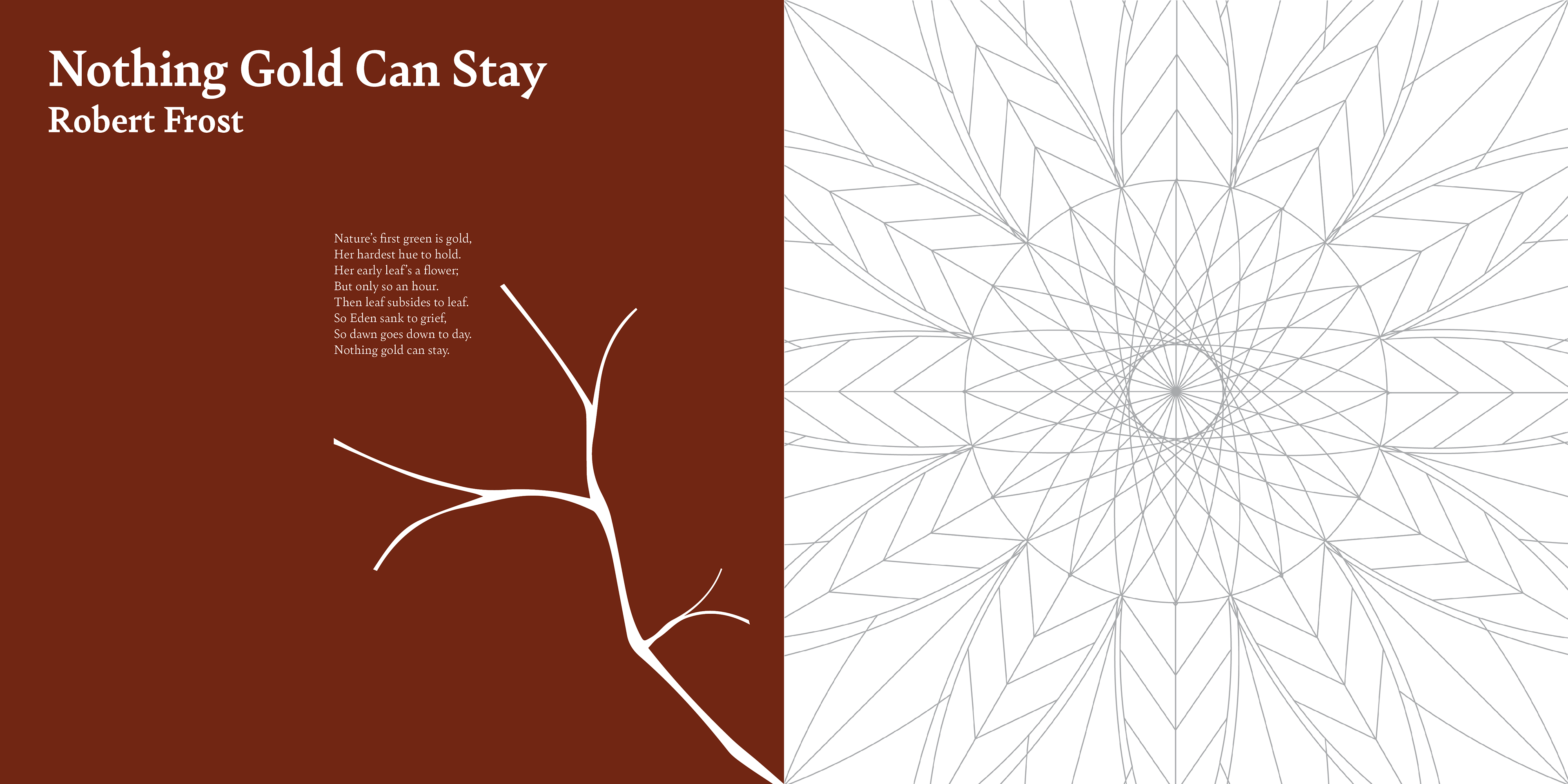
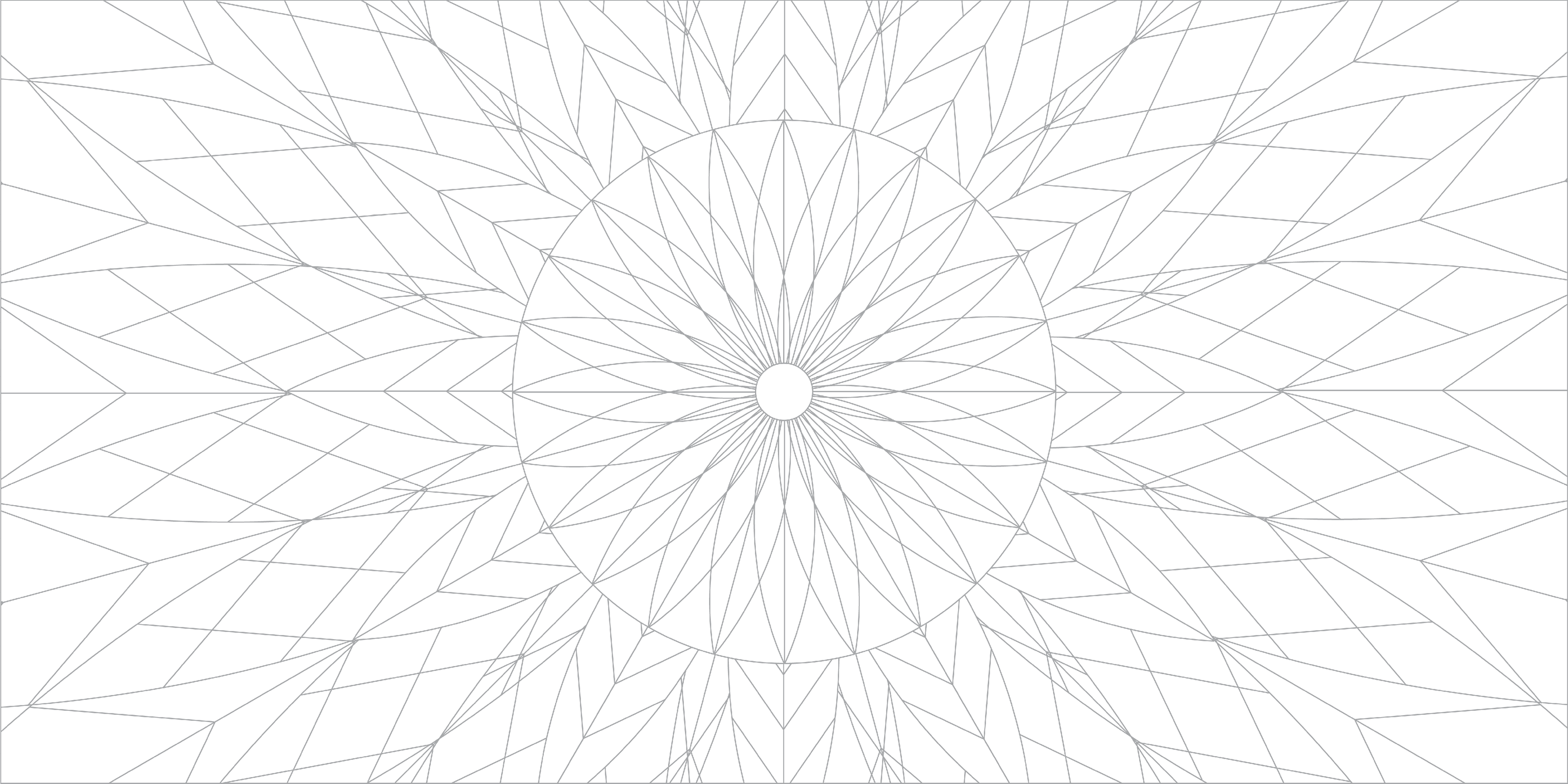
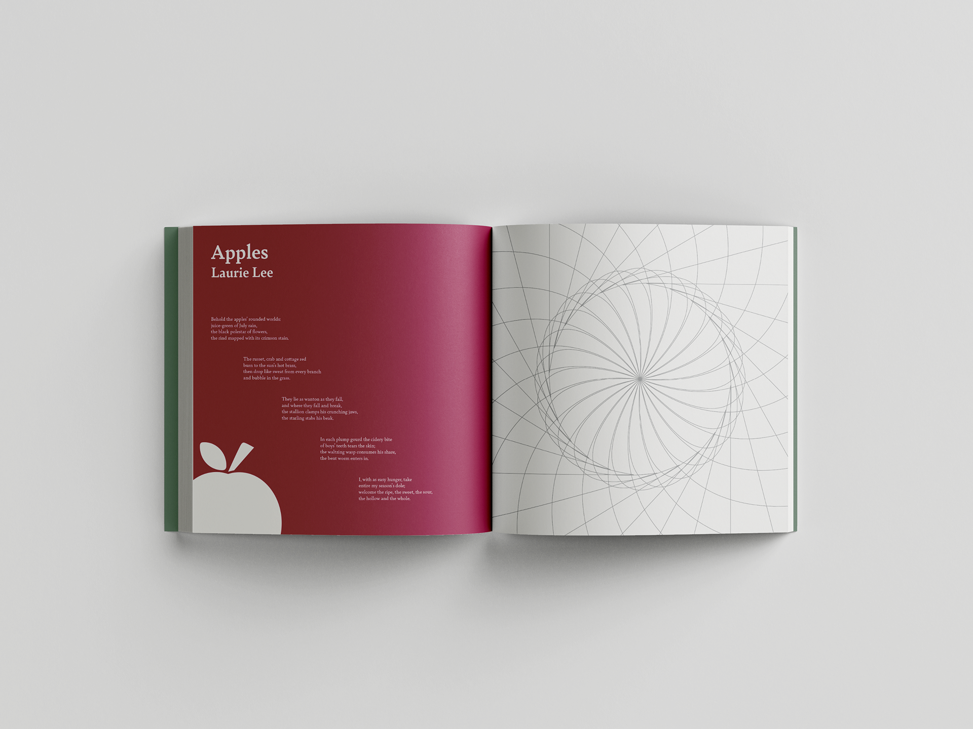
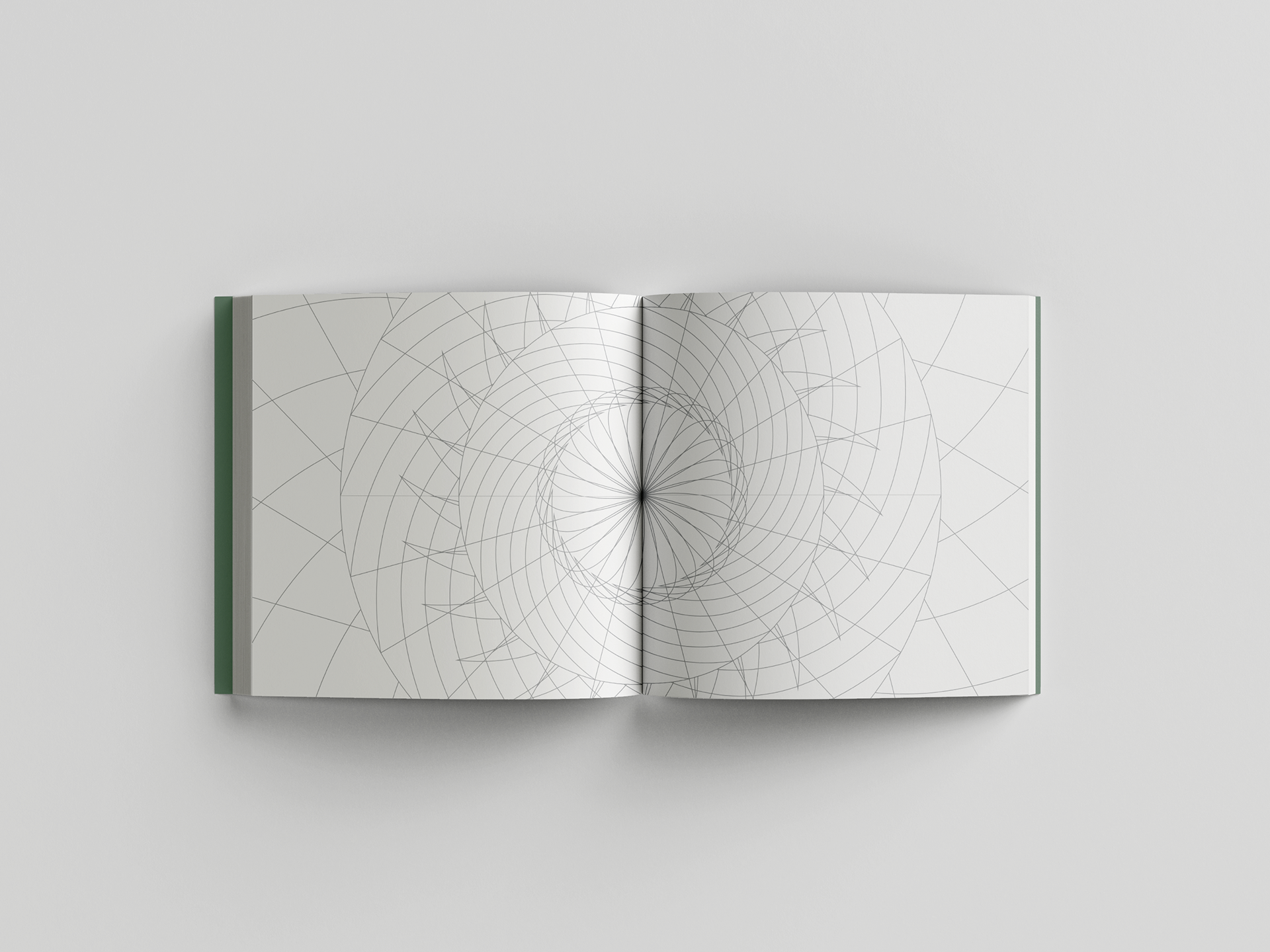
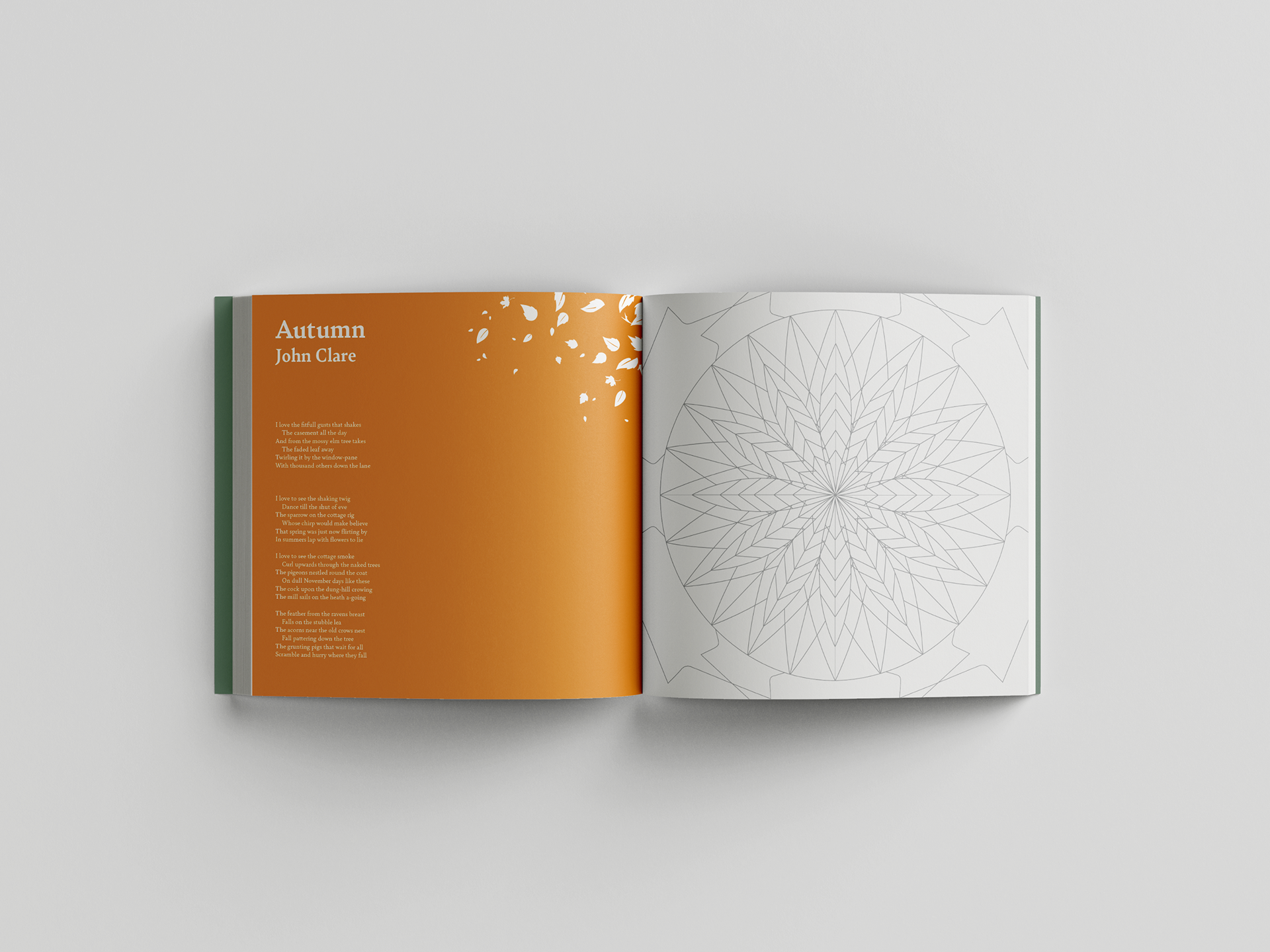
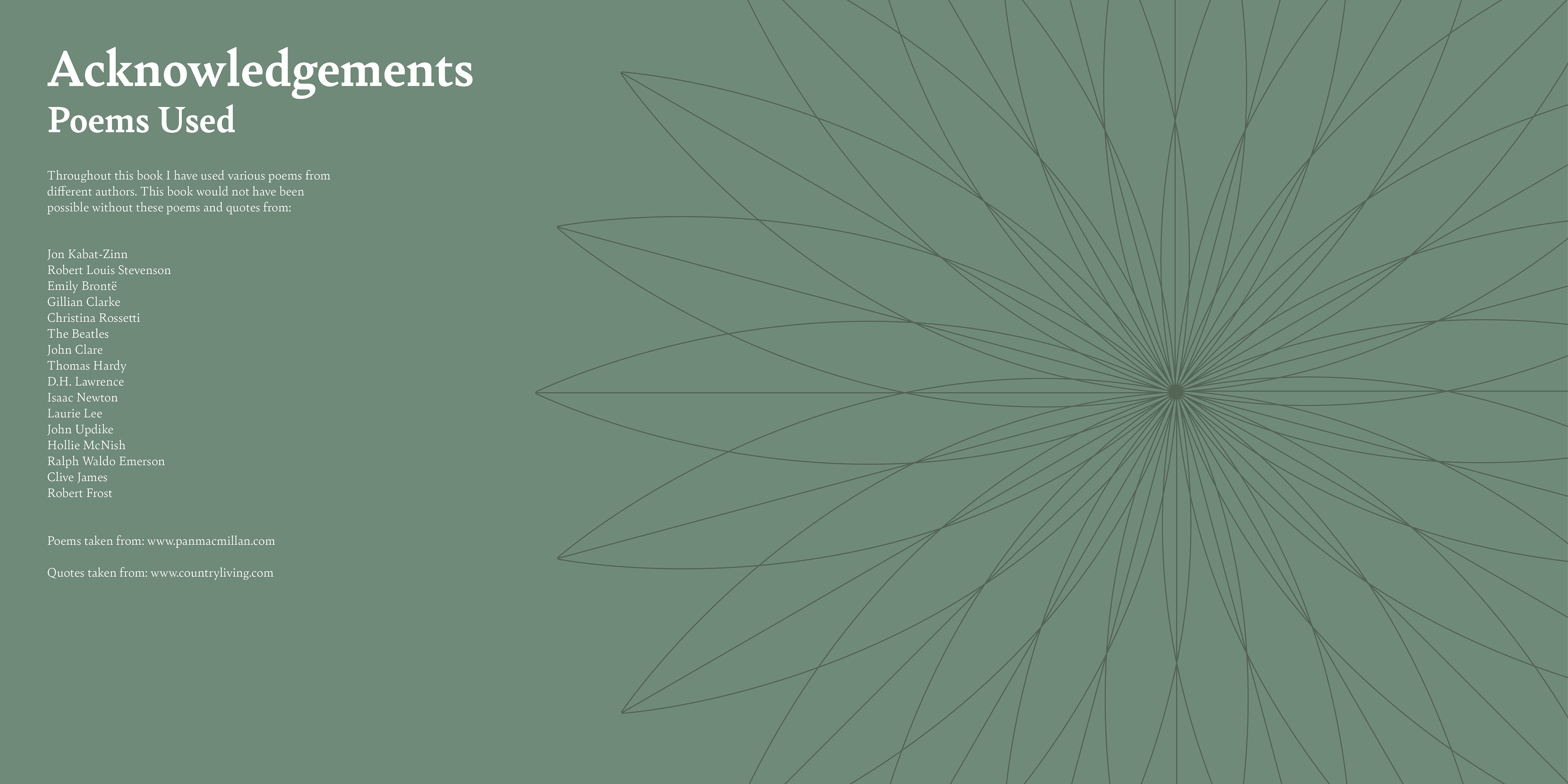
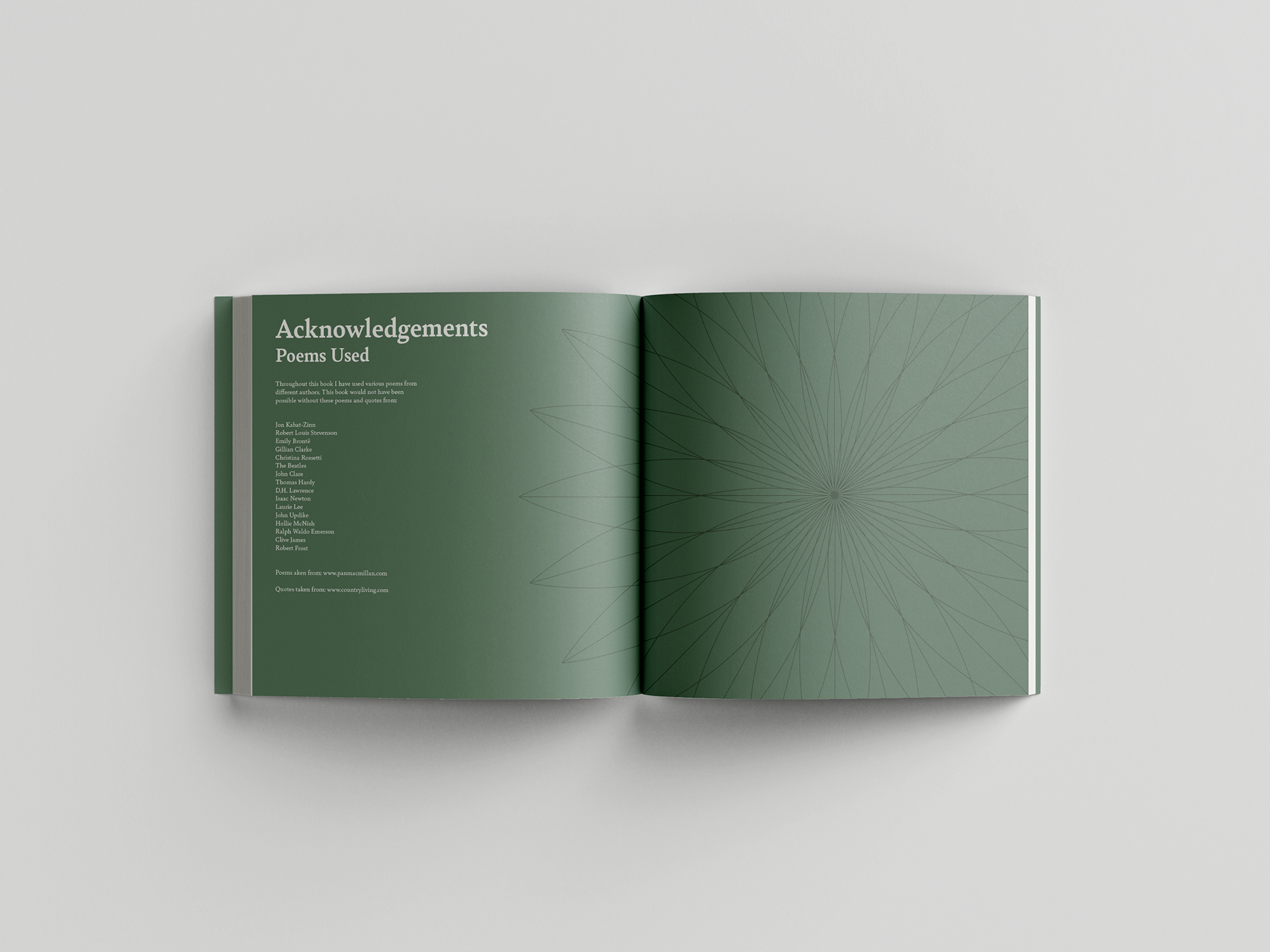
Natures Patterns is the result of an ISTD brief based around creating a typographic piece of design that celebrates our connection with nature. We were tasked with designing something that provided an direct experience with nature through design and typography. I decided to take the direction of creating an editorial piece to solve this brief, and I designed an adults colouring book that featured poetry from different authors to do this.
Unfortunately, due to COVID-19 I was unable to print the book, so here you will see the digital spreads. However, I did mock-up some pages to demonstrate how it would look if it was printed.


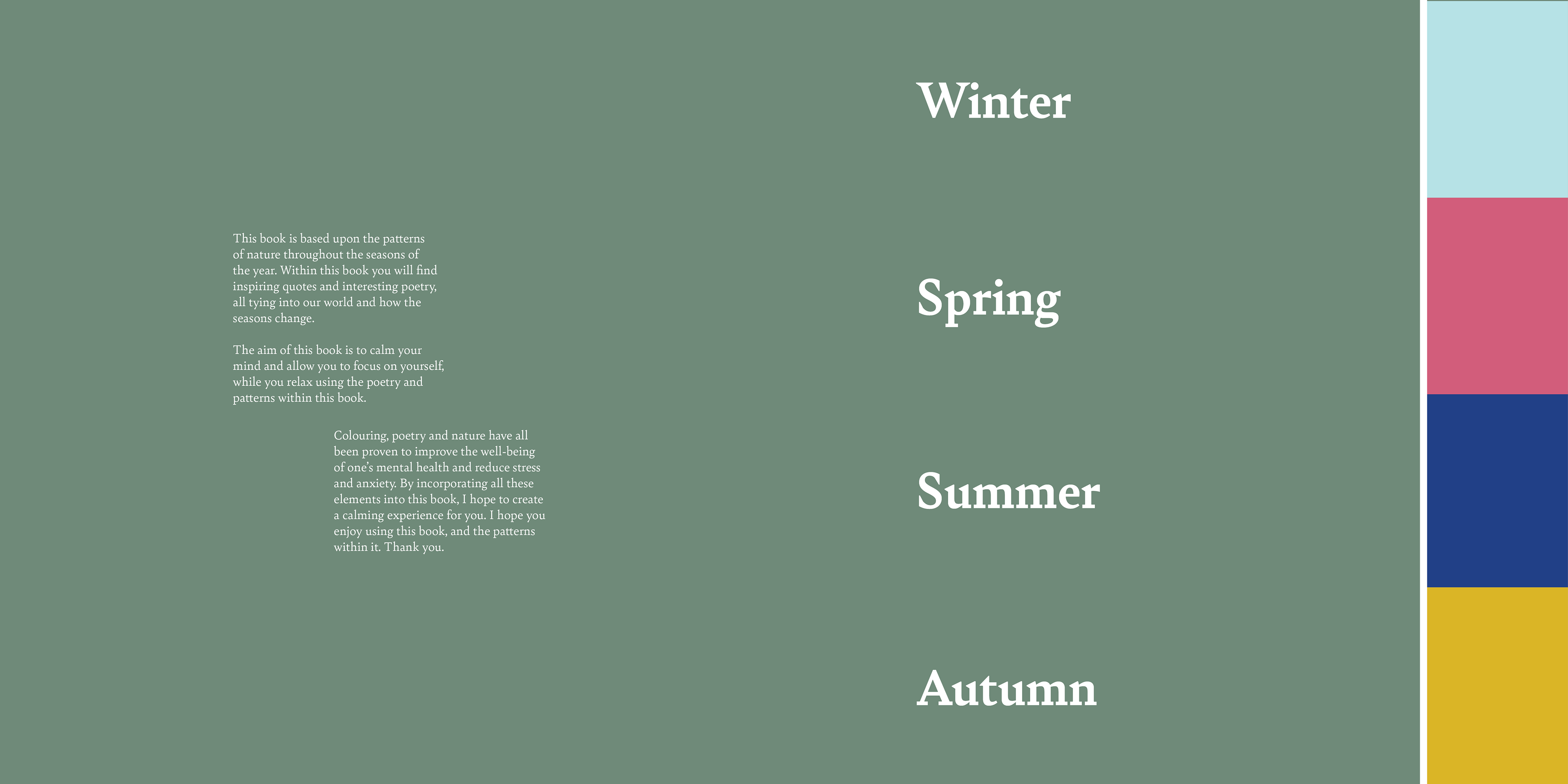
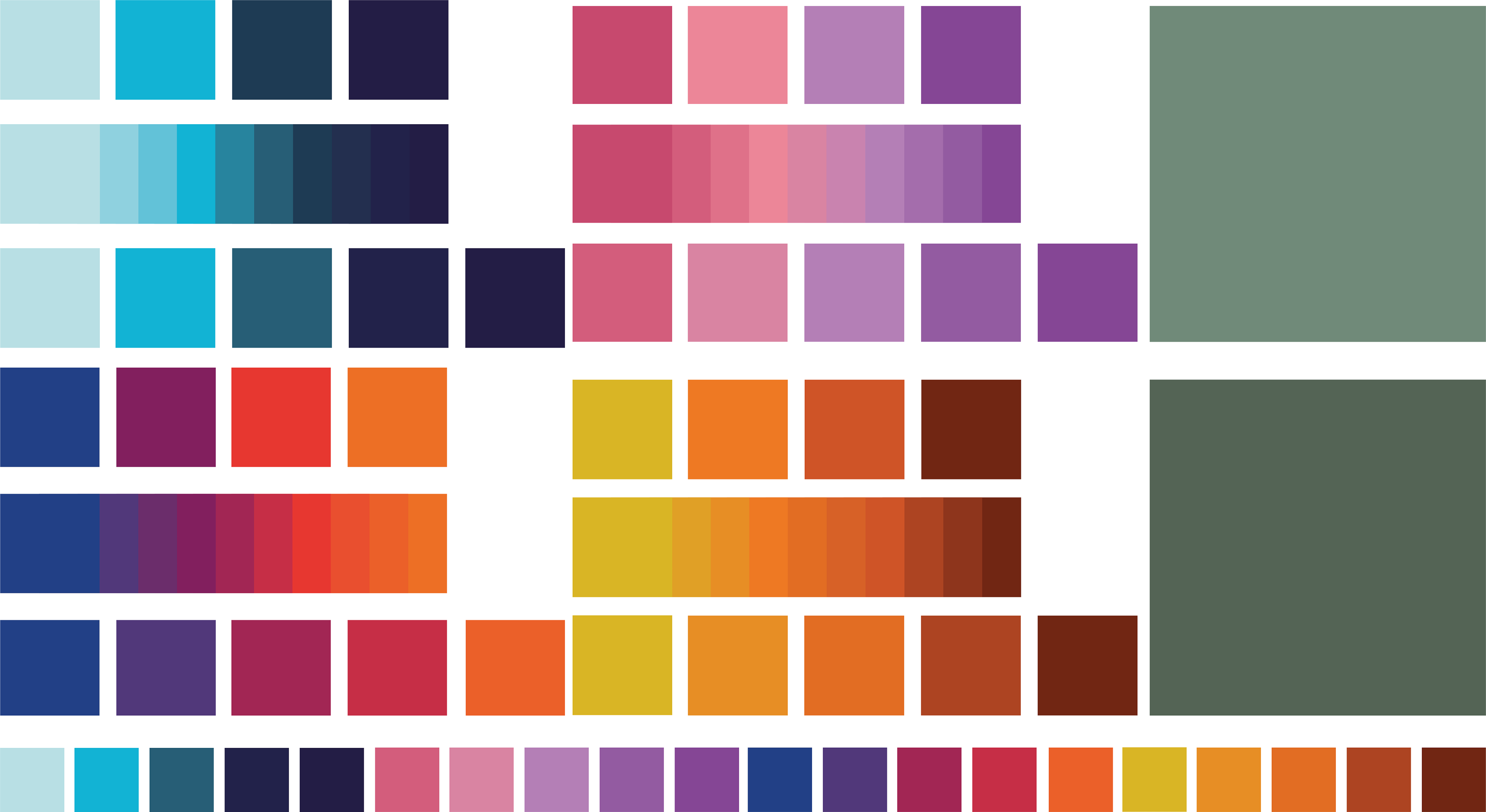
COLOUR PALETTE:
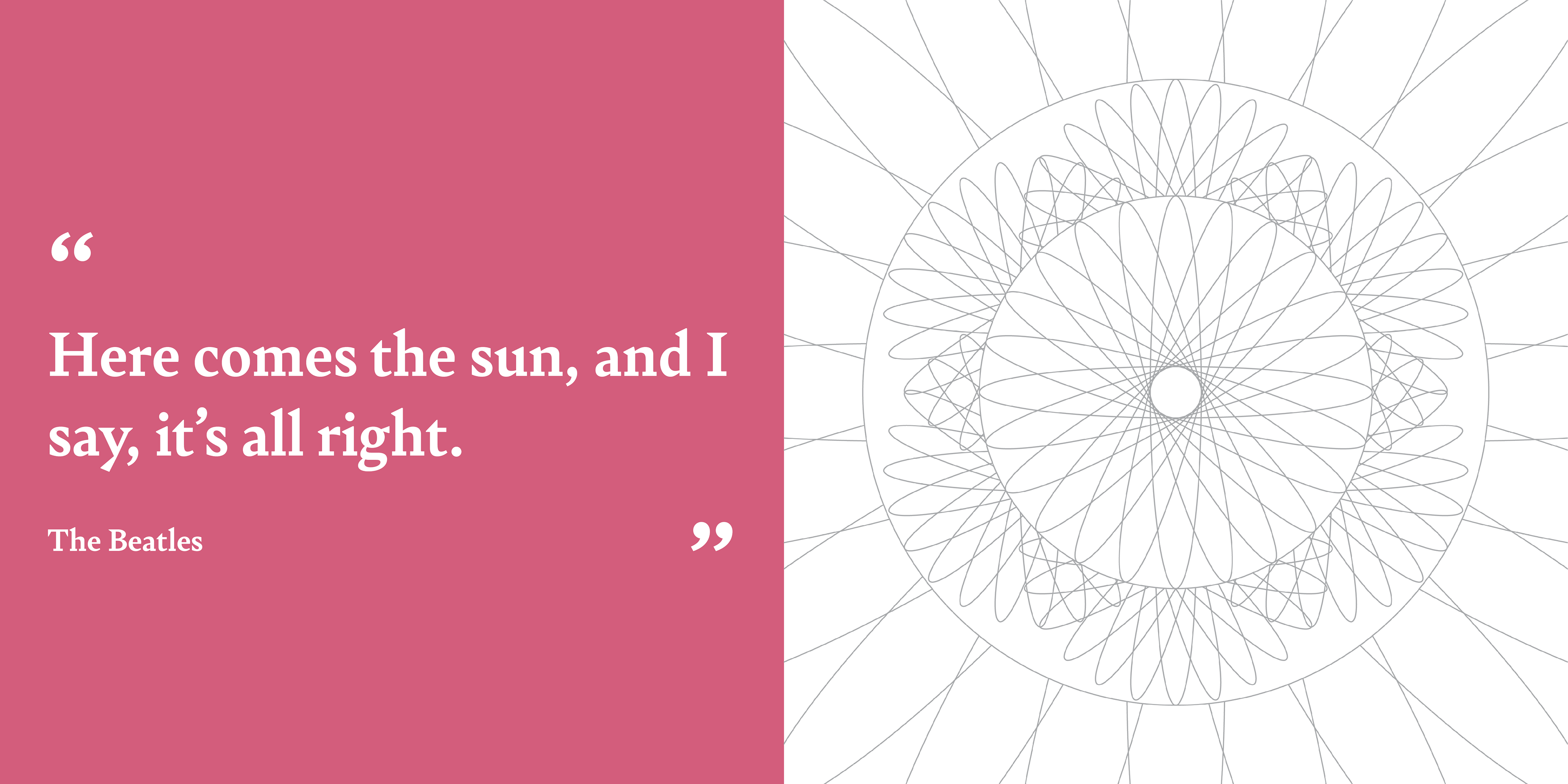
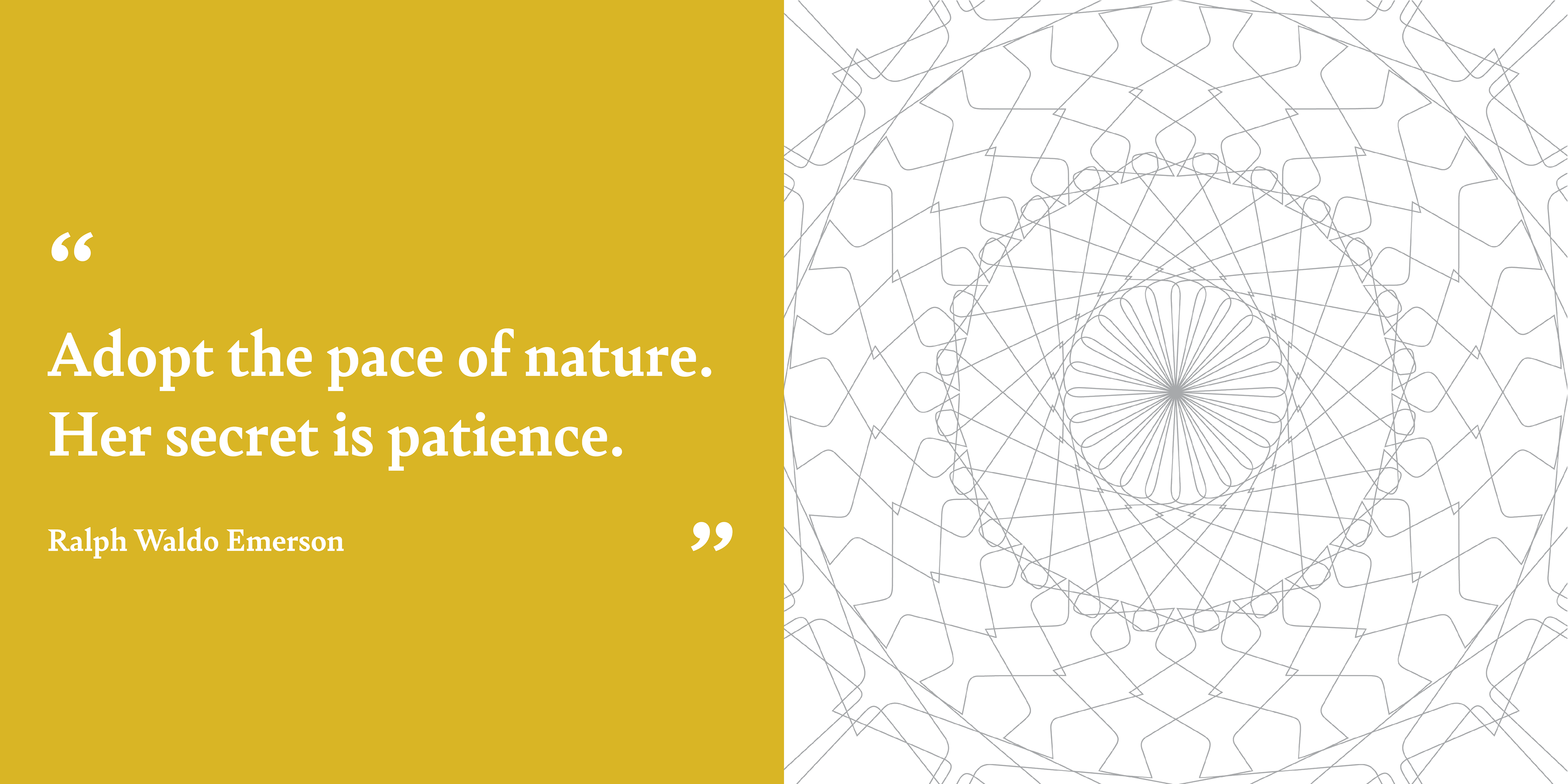
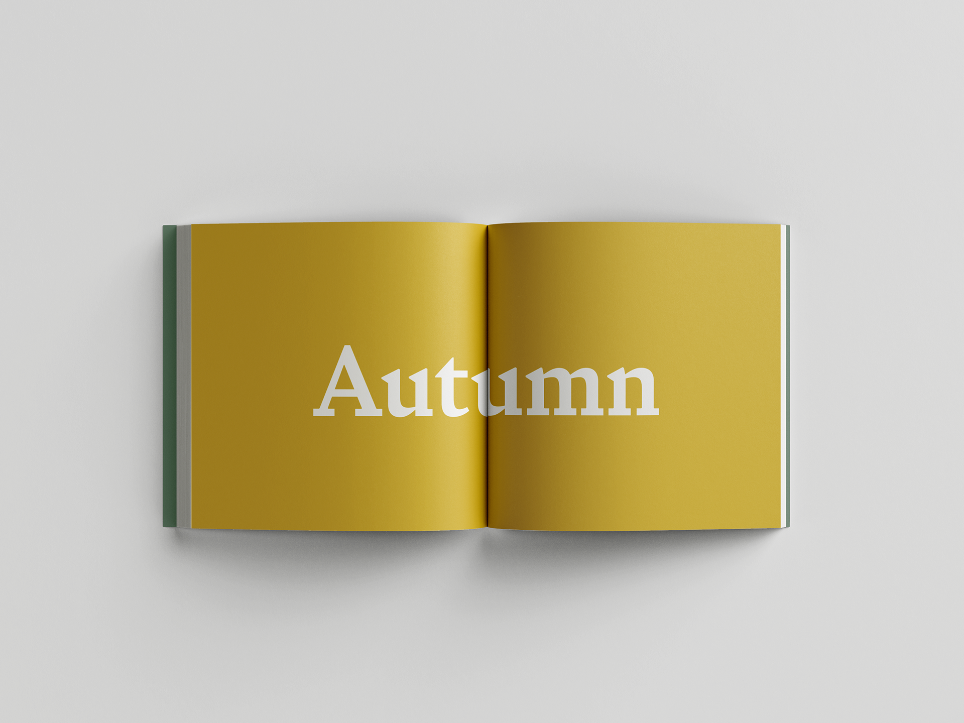
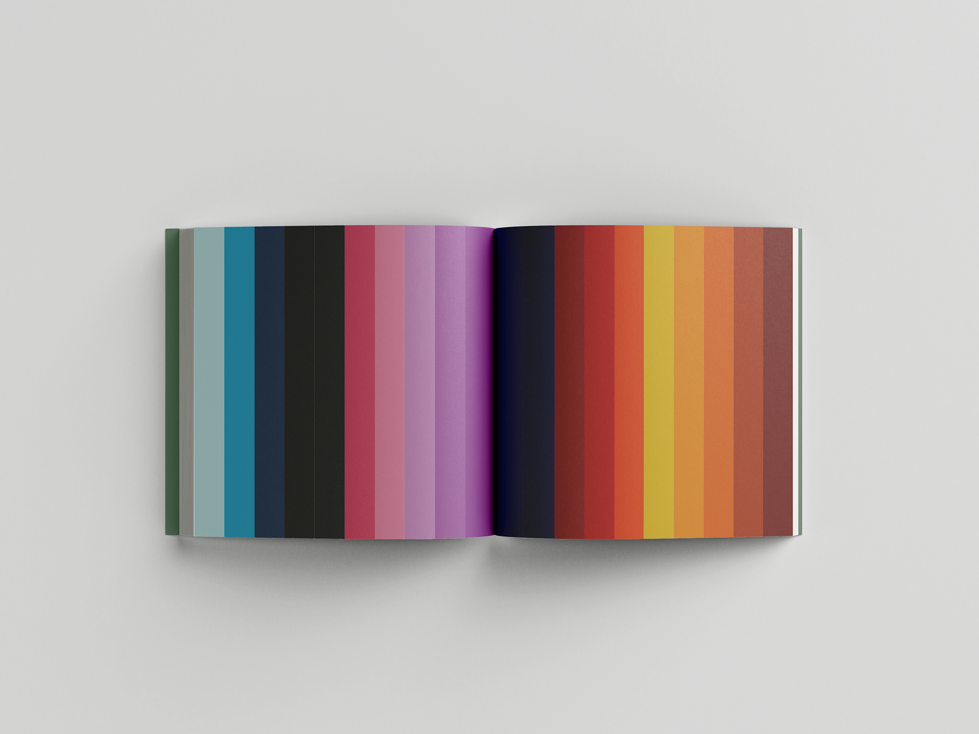
These are the colours that I used throughout my editorial piece. I based the colours for each section on their respective season, with the colours transitioning into the next season at the end of each individual colour palette. The colours create the year expressed through colour. I used the two green colours as I felt that they represented the calming and peaceful aspects of nature well since they're very stark.

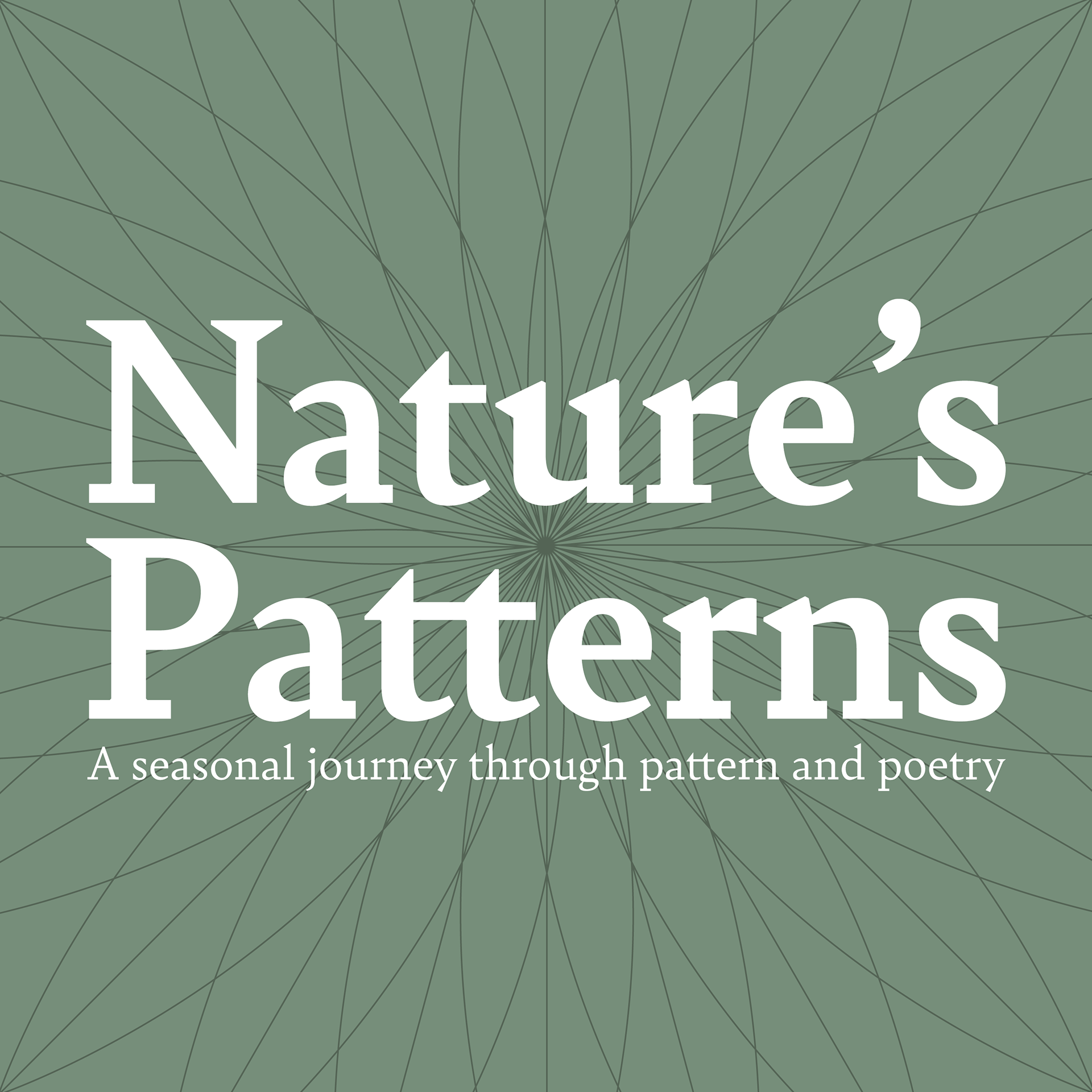
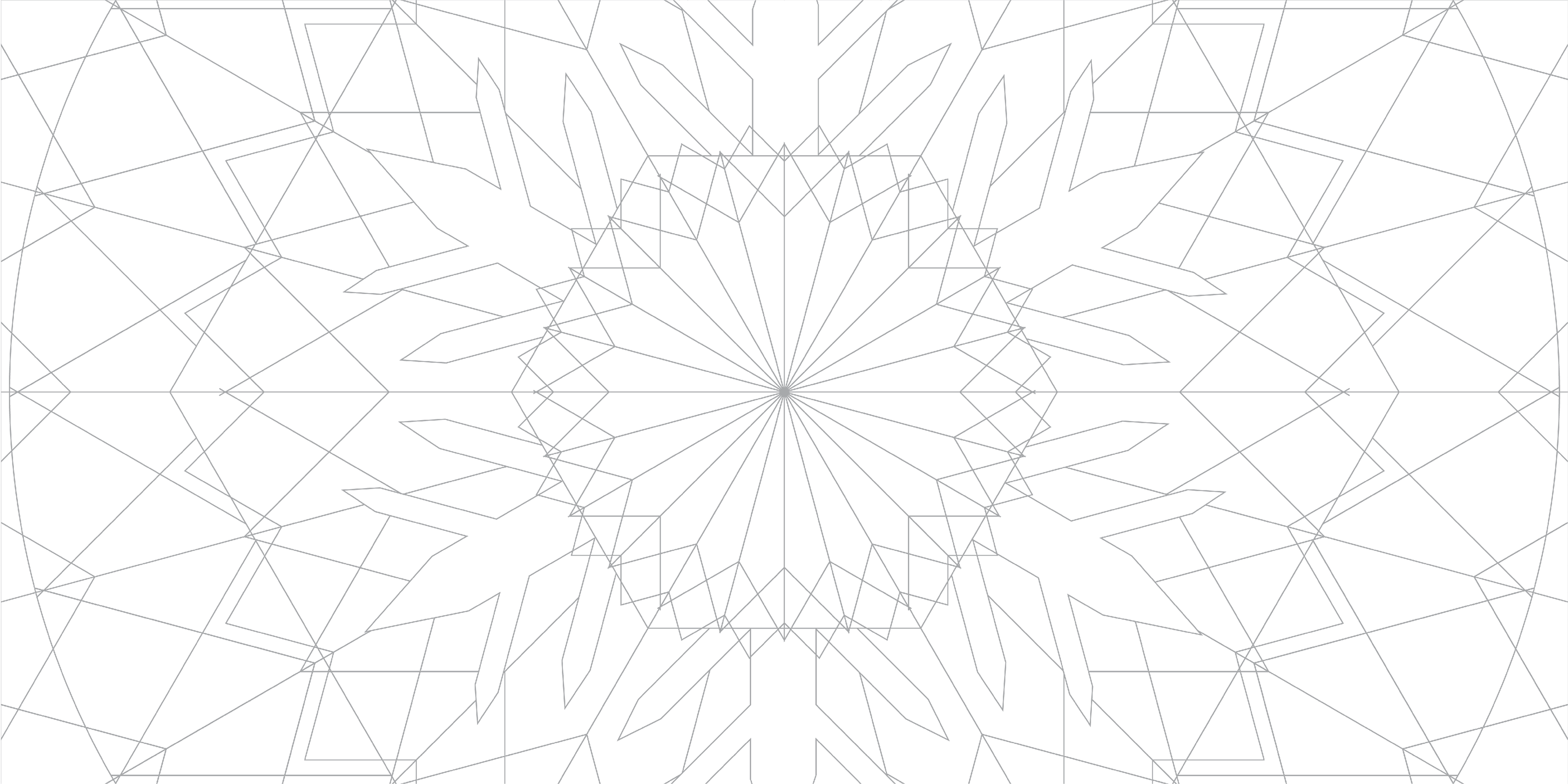
FRONT COVER
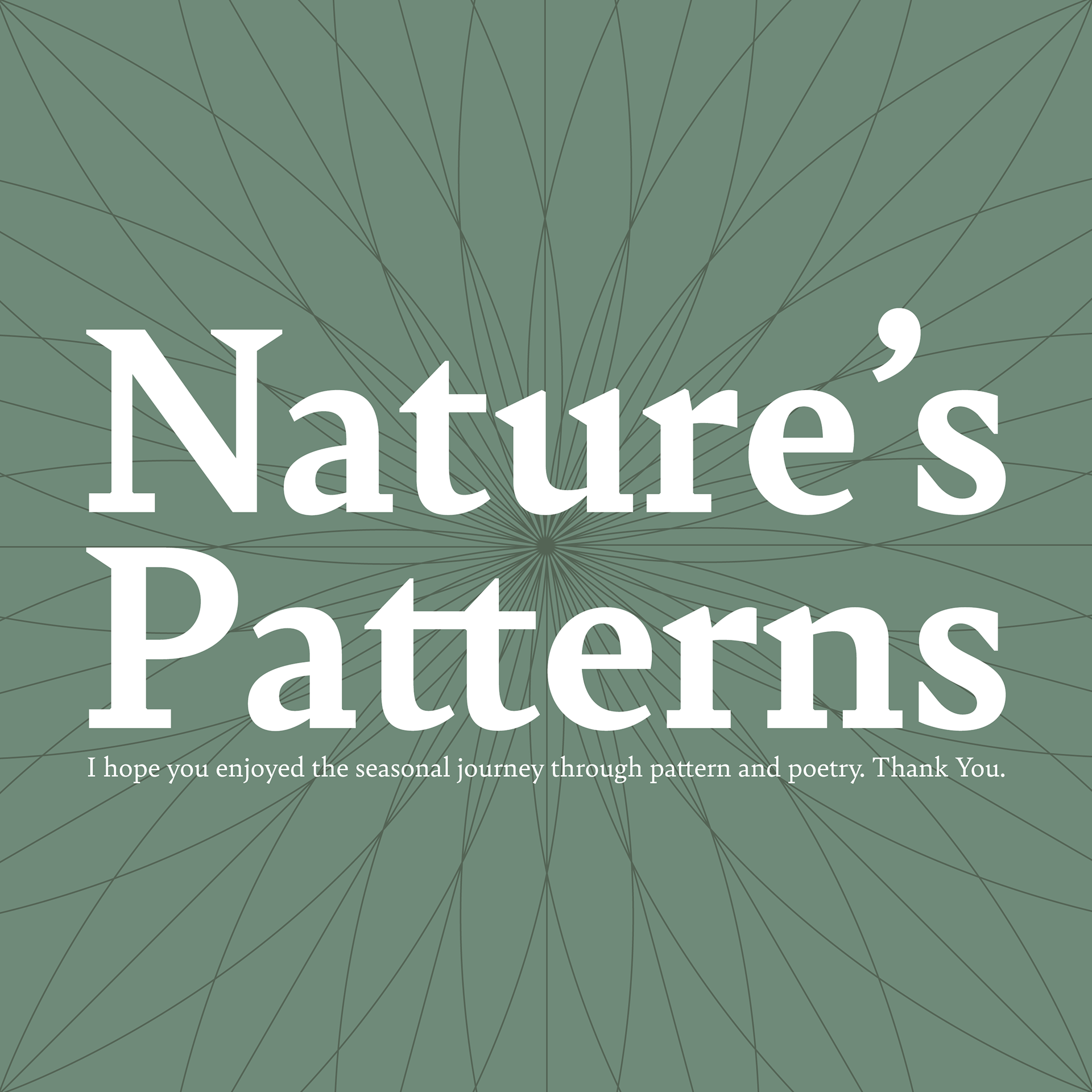
BACK COVER
FRONT AND BACK COVERS:
I wanted the front and back covers to be nearly identical to each other so that the book started and ended with a similar design. For the design of these covers, I used the serif typeface Bely Bold for the typography. I felt a serif typeface was appropriate due to the subject of the book, since poetry is a traditional form of literature and I think serif typefaces work well for my traditional subject matters and designs.