FEDRIGONI X OLIVER BONAS:
YCN Brief at University of Portsmouth (2019/20)
BRIEF:
To design outer packaging for a new range of nature inspired candles from Oliver Bonas, using Fedrigoni's Woodstock paper range. The packaging had to appeal to the audience of Oliver Bonas, and showcase the quality of Fedrigoni's paper. The designs had to be inspired by nature to fit the theme of the range of candles Oliver Bonas was offering.

ONE
TWO
THREE
FOUR
DESIGNS FOR PACKAGING:
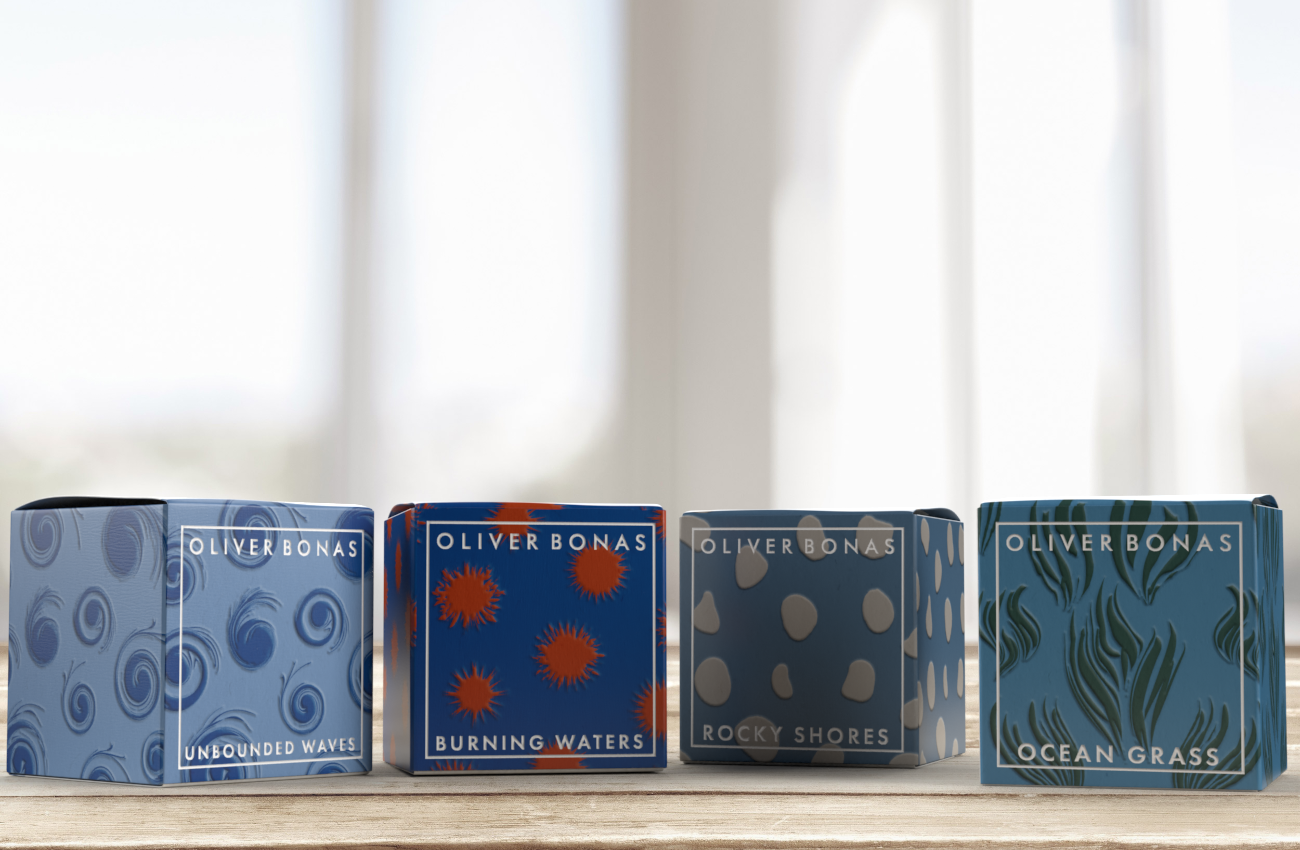
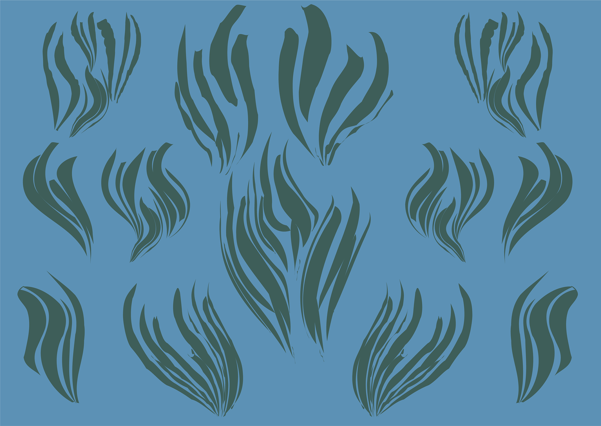
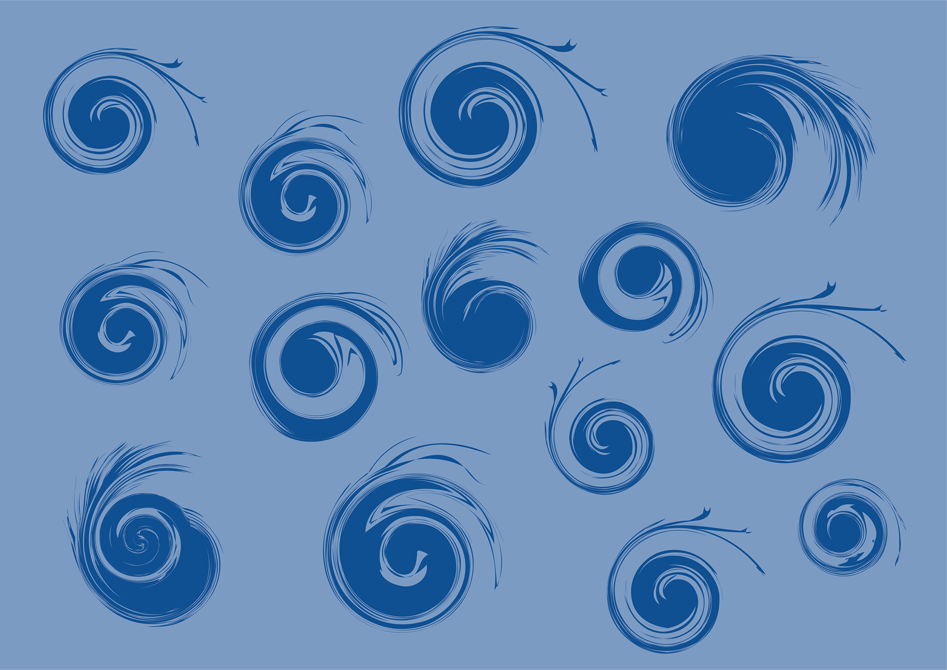
I chose to go with a coastal theme for the designs of my candle packaging. I felt the coast linked well into nature, and also represented the peaceful aspects of both nature and Oliver Bonas' candle range well. For each design, I based it on a different aspect of the coast, however they all linked into the sea. Design one was based on seaweed and plant life in the ocean, deign two on waves, three on rocks and four on sunsets across the water.
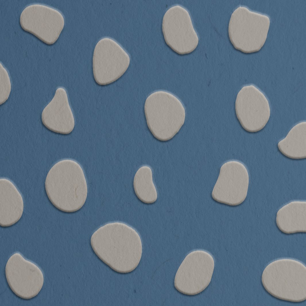
EMBOSSED DESIGNS:
To showcase the quality of Fedrigoni's paper, I wanted to have the designs for the candle packaging embossed. These are the embossed versions of the designs for each candle. Accompanied with Fedrigoni's paper the embosses effect creates a nice texture for the packaging, enhancing the overall experience for the user.

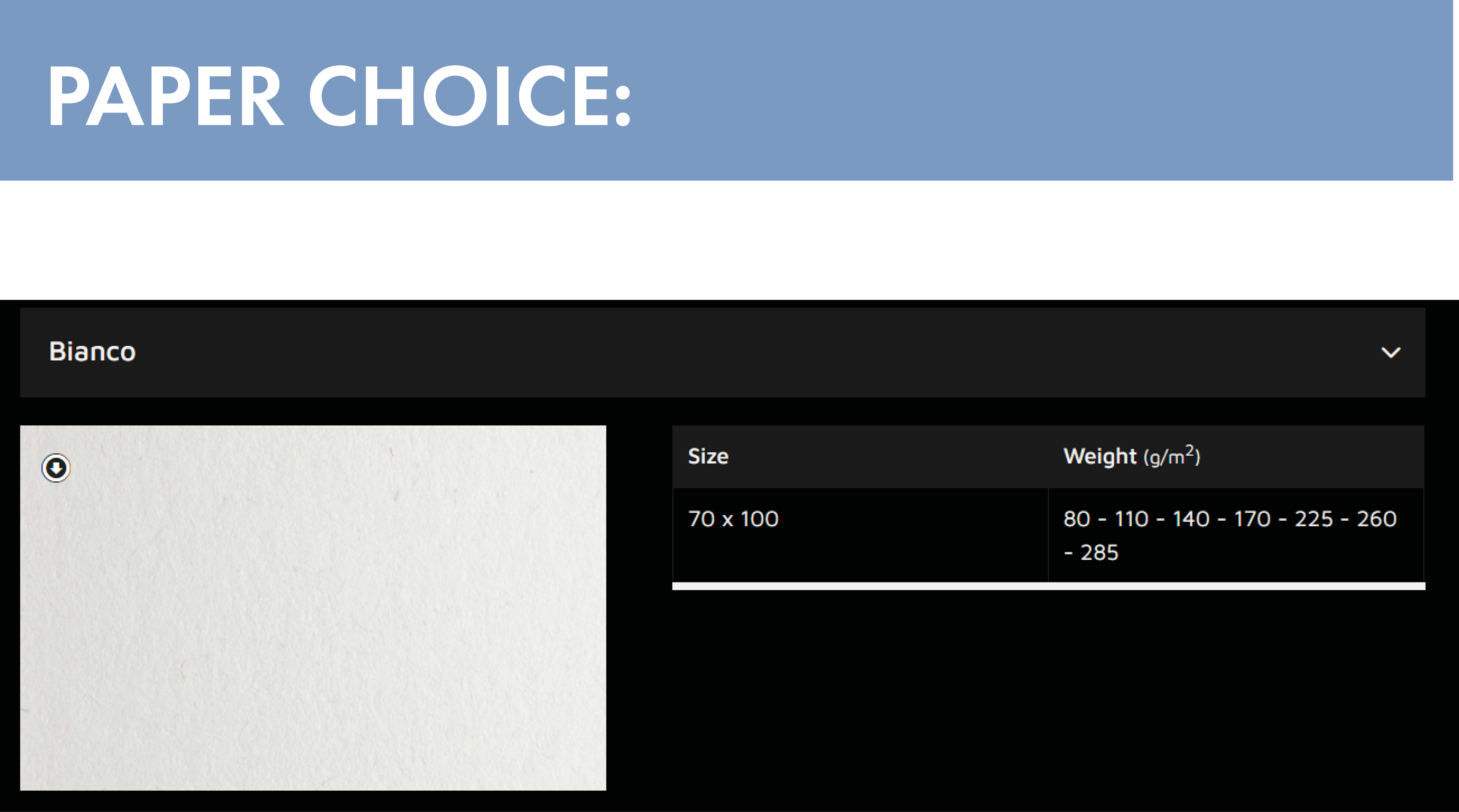
PAPER CHOICE:
For the packaging of these products, I would use the Bianco paper from the supplied Fedrigoni Woodstock range. I would use the 285 GSM variant, so that the embosses design can come through appropriately. This paper would also give the packaging a nice texture which would accompany the embossed design nicely. I wanted to use this paper because it would allow me to print my coloured designs onto it easily since it is white.
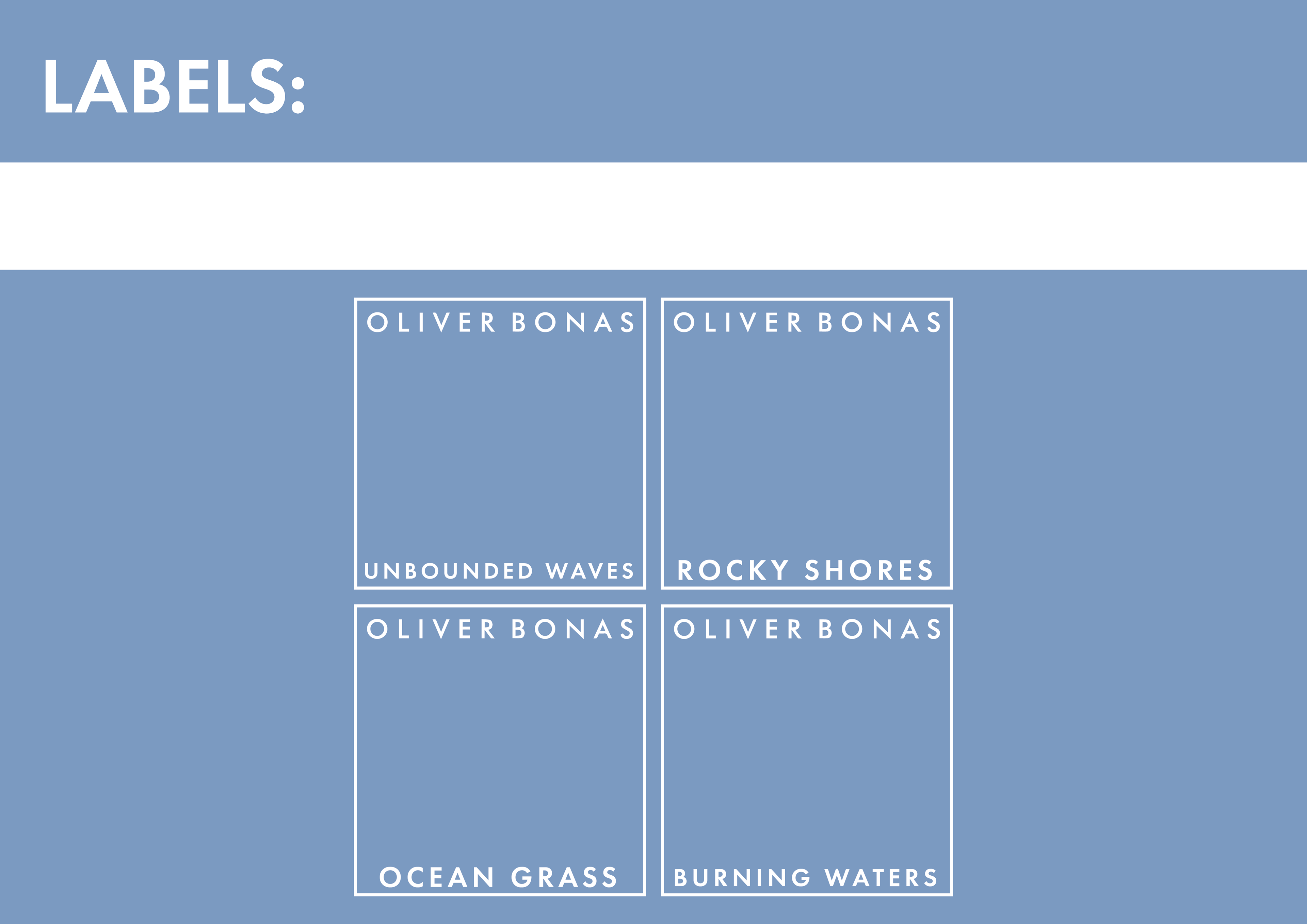
LABELS:
These are the labels I designed for the packaging. I wanted to make the labels simple, and similar to what Oliver Bonas already uses so that they fit in within the store and customers were familiar with the design. The labels feature the name for each scent at the bottom, which links into the respective designs for each candle in the range.

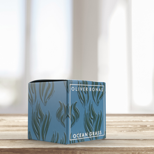
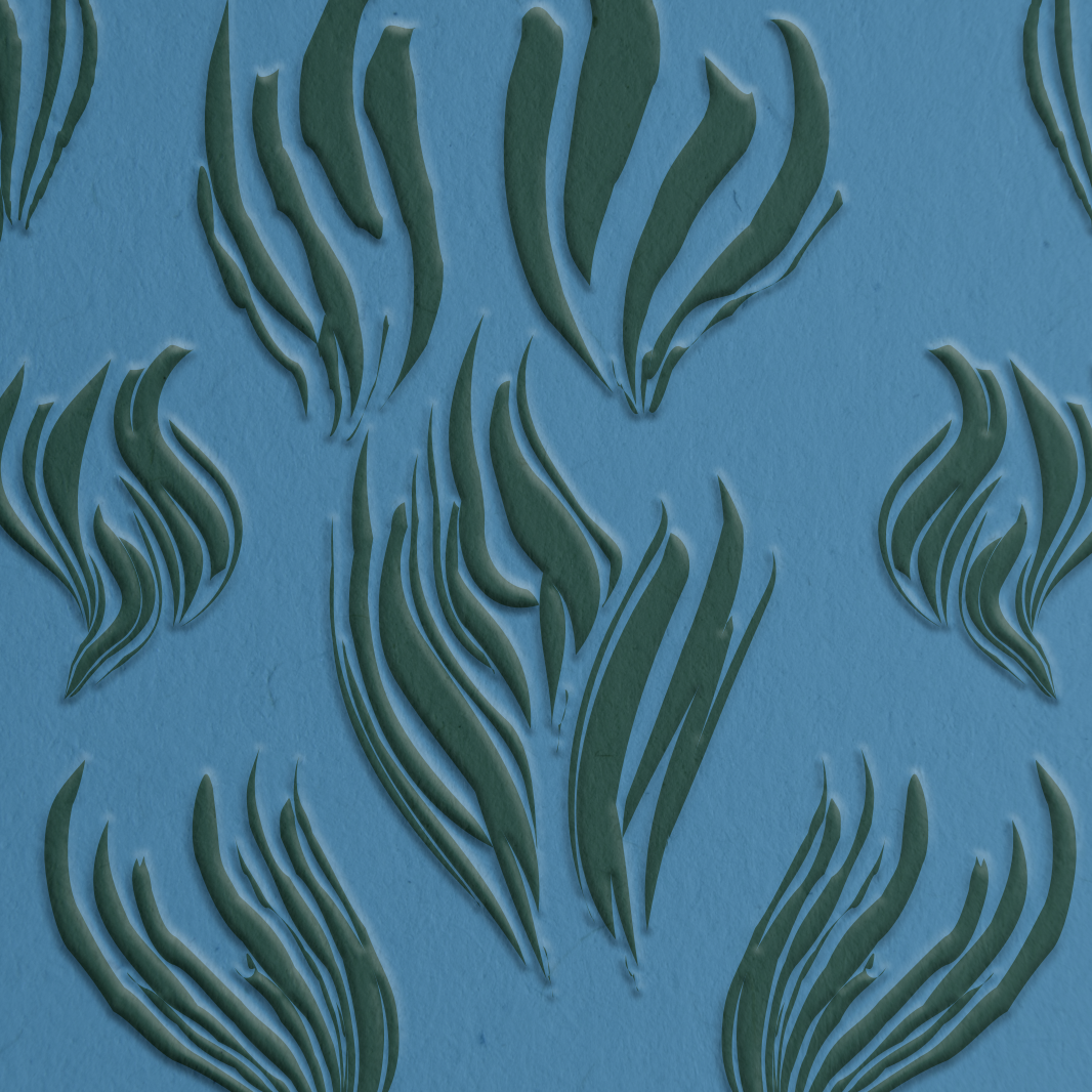
OCEAN GRASS:
For this design, I wanted to incorporate the plant life of the coast into the design. I like the contrast in colours between the green and the blue, so I went with this seaweed inspired design for this candle. Using Adobe Dimensions, I mocked up the packaging design. This allowed me to showcase the embossed design with the texture of Fedrigoni's Bianco paper.
UNBOUNDED WAVES:
With this design, I wanted to have it reflect the waves of the ocean. However, in order for this design fit within the aesthetic style I wanted to utilise instead of regular wave-shapes, I used swirls instead. This worked much better with the style I used, and the embossed effect worked well with this design. For each of these designs I also have the label debossed into the design itself instead of being printed on, which further improves the textural and depth differences in the packaging.


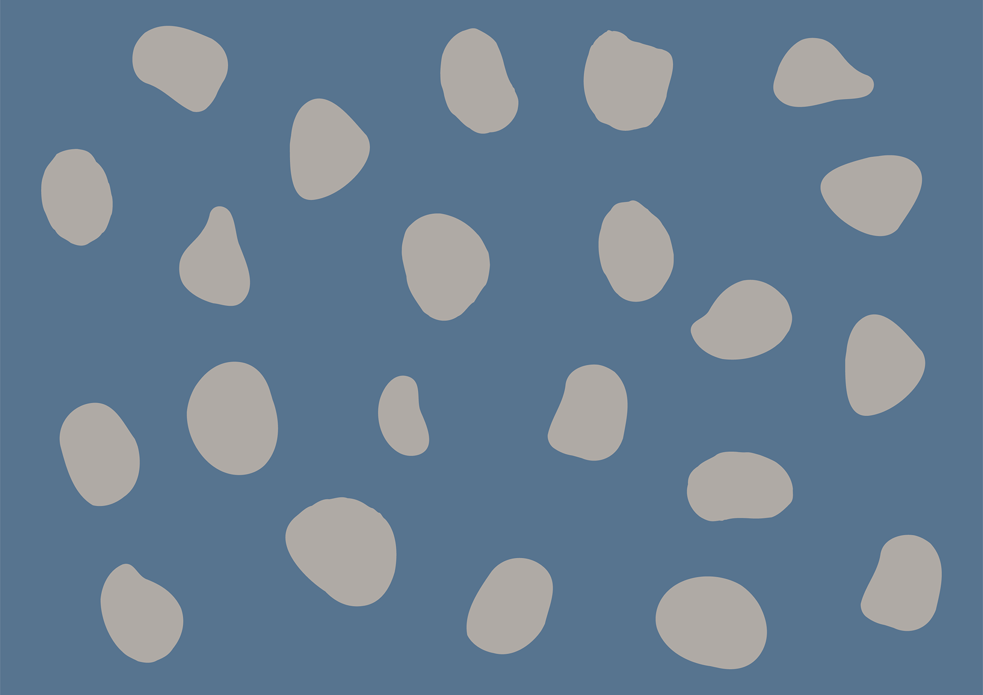
ROCKY SHORES:
The 'Rocky Shores' design was inspired by the rocks and pebbles that wash up on the shores of the beach, and are found within rock pools, around the coast of the UK. The rocky pattern is similar in style to the other designs within the range so fits in well and works within the set.
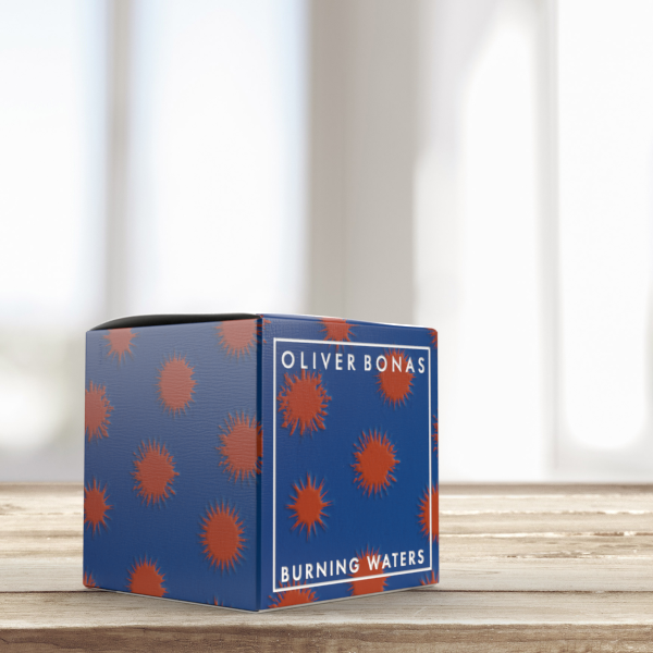
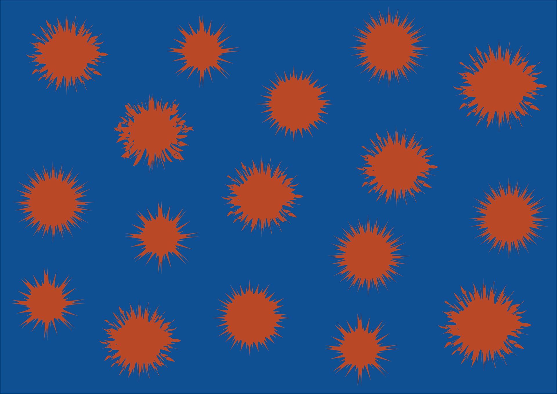
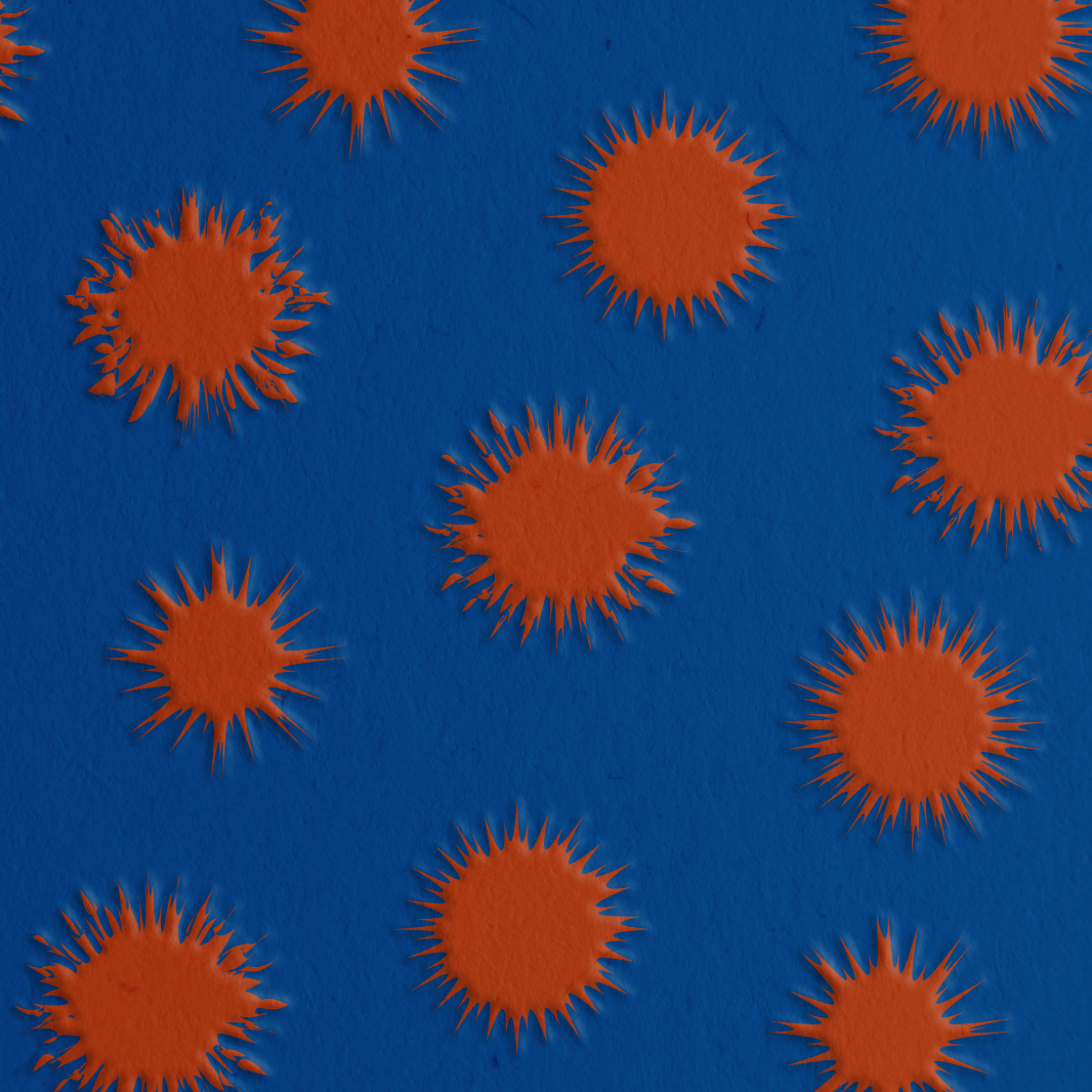
BURNING WATERS:
The design for 'Burning Waters' was inspired by the sun setting over the ocean, creating reflections within the water. I wanted the sunset elements to act as if there were exploding and burning within the water, so I went with this design and colour.